UX checklist: 6 Common mistakes to avoid while designing a SaaS-based product
Dec 30, 2022
SaaS business faces multiple challenges, and some of them are to exist in the competitive market space, retain existing customers & stand out in the crowded industry to convince the new potential customers that their SaaS product is worth investing in.
Solutions to such challenges start with addressing the initial interaction that users or customers have with the product or brand, i.e., the design.
By creating more personalized interactions and smarter communication, they can give new users an interactive virtual tour of the product to establish trust and sustain existing users with a delightful support hub.
To make the explanation clear, we’ve managed to point out six common design-related mistakes that SaaS-based businesses should consider avoiding.
1. Designing Biased Products
Designers often tend to commit the mistake of designing for themselves or designing based on their past experiences and biases formed over the years, and this might not be the right practice. In any industry, it is common for professionals to form opinions and filter facts and usability testing. It is crucial for every product and more importantly, for the user that it gets designed with him/her kept as the center of focus.
Fixes to avoid such pitfalls:
- Quantitative Research & User Personas: Instead of relying on the general assumptions on what you think users would like, use information collected from a series of interviews, surveys, etc. Design decisions backed by well-researched information and analysis go a long way. Creating user personas help to a reasonable extent.
- Identify Pain Points: Pain points often get revealed during user interviews when they speak on their opinion regarding other similar services, relatively. Designers can capitalize on their products with this piece of information to create a better and more useful user experience.
- User Testing: No product is complete with live user testing in real-time. This phase brings out everything that’s missing and redundant, affecting the product’s or services’ performance.
- Re-iteration: Reiterating is like polishing the product, fixing the bugs, sometimes rolling back to previous features because the users didn’t find the new one comforting. It’s a never-ending process that aligns itself to the user’s needs.
2. Vague Messaging & Extensive Technical Writing
Working in a business-oriented SaaS industry sometimes makes it routine for professionals to use technical language. It is easy to forget that even though the sector is functional, but the audience to whom they’re catering their product would prefer more straightforward understandable language.
Here’s an example from the website Gatesnfences of how not to write about your service-
“Designed to Enhance the Entry of your home with Custom Ornamental Decorative Driveway Gates while bringing Safety, Security, and convenience.”
Avoid using overly technical jargon and lines; they’re more likely to come off as vague. Such messaging might sound neat, but most definitely leave the visitors in a state of confusion.
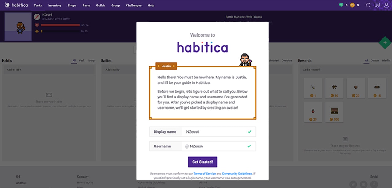
This is an example from Habitica, and how they use a fictional character called Justin to onboard you through their website with clear messaging, it also lets you customize your caricature.
3. Focus on Benefits, Not Features
It is a widespread outlook in every business that designers tend to develop an emotional attachment towards their designs. Products become more about flexing about themselves than showing how it is beneficial for its customers.
To personify- Products become their narcist self or designers make them.
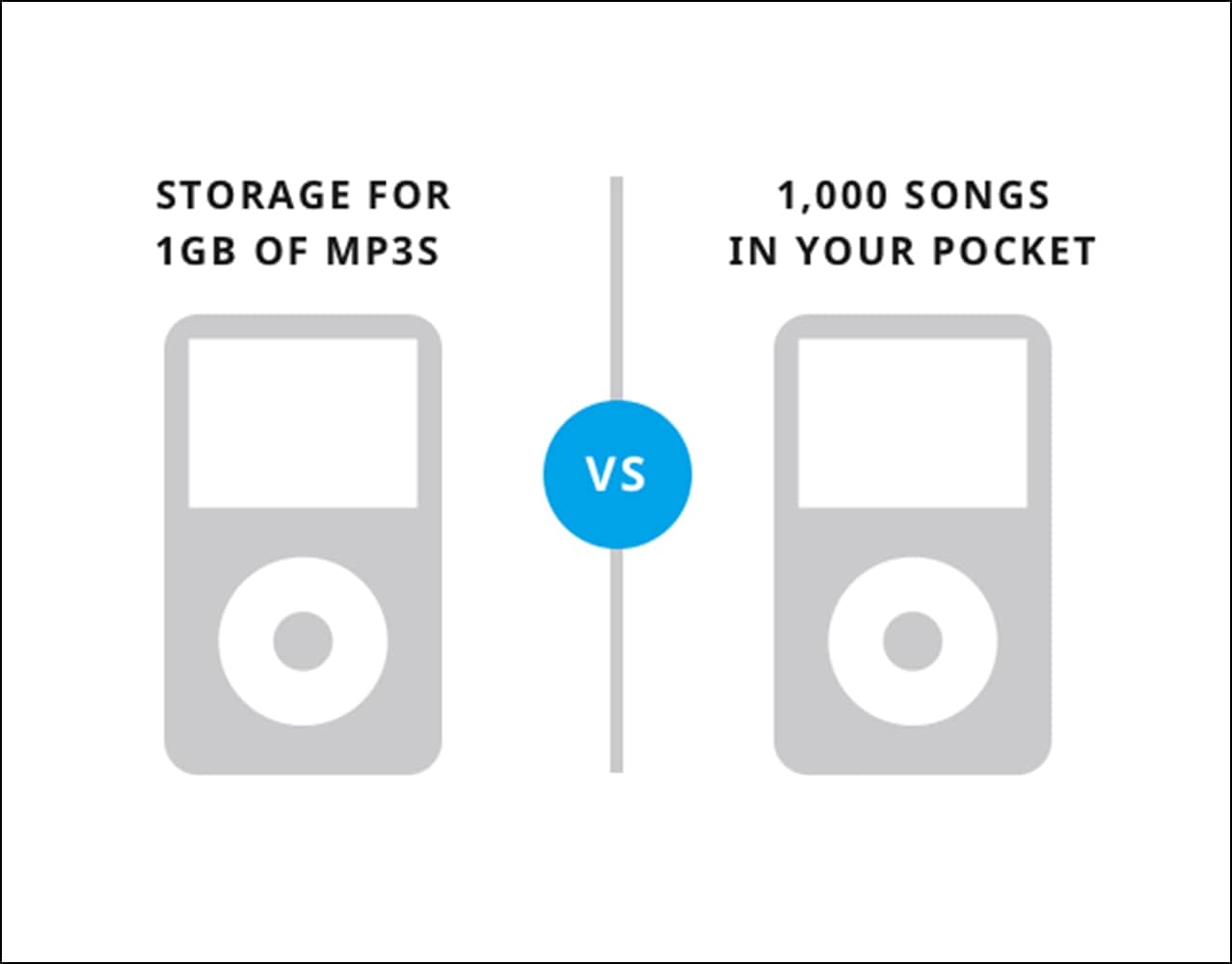
Conveying how the usage of a product or the service is making a difference in the user’s life creates a more significant difference in how information gets consumed.
4. Almost Zero Social Presence
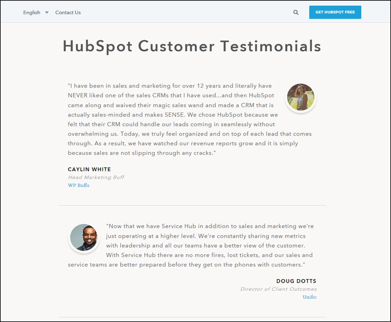
When it comes to SaaS products, having testimonials, reviews from the client showcased on your webpages helps from the marketing perspective. It is equally crucial as such information creates an intent for future clients to use your product.
Trello, a task management application, it’s primary advertising tool is its software quality. Marketing and promotion are not all about paid campaigns and great blog content. Trello took the more passive but sturdy approach because they knew it would bring them targeted and organic audience. Their goal was Word-of-Mouth (WOM) marketing, and they use the presence created to actively roll-out information about their updates, fixes, and features.
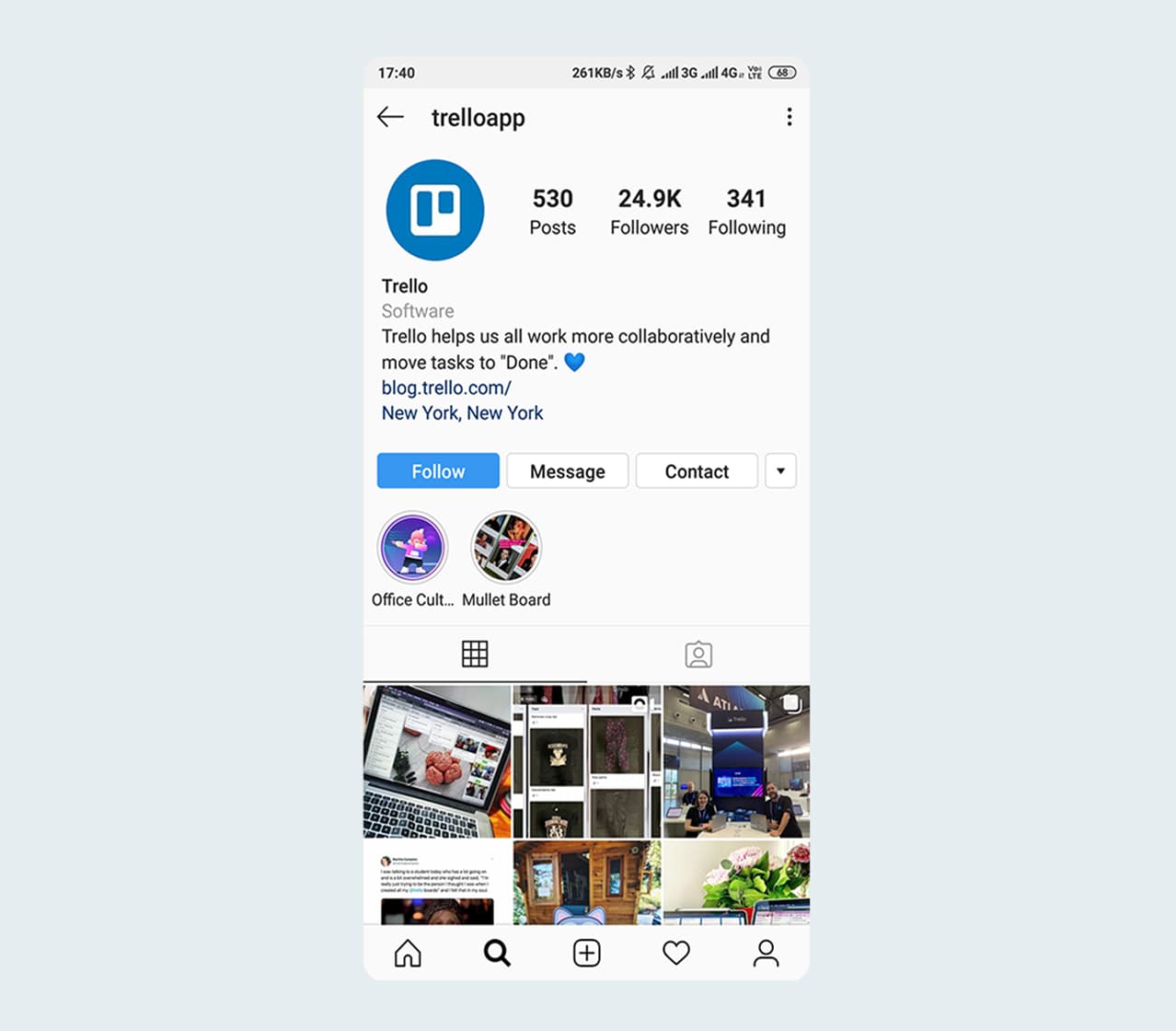
Source: Trello Instagram
5. Not Providing an Option For Free Trial
Not including a free trial is a potential loss for SaaS businesses. The prompt Try before you buy is essential. Even though visitors can get some insights from screenshot and promo videos, the feel of actually using the product is entirely different. Offering the trial gives users a first-hand experience and motivation to invest in the product.
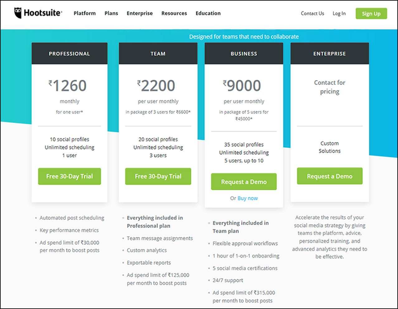
Hootsuite provides a 30-day trial for all its basic plans and more prominent programs,i.e., at Business and Enterprise levels, it offers a live demo as well.
6. Non-Responsive Designs (For Mobile)
Even though many business activities happen on larger computing devices, but the increasing use of mobiles and market tilt towards mobile apps and PWAs are visible. Not having a mobile version of the product or service is one of the last mistakes that a business could make, because everyone nowadays would prefer and actively root for the possibility of being able to work on the go.
Here’s an example of a Google Firebase, analytical and engagement tool for PWAs and Native Apps. Imagine if a user lands on your website from a mobile device expecting an actionable webpage, but all he or she sees is a web page in the form of a blog article.
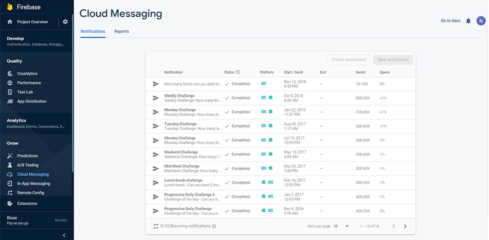
Google Fire- Clean Web UI
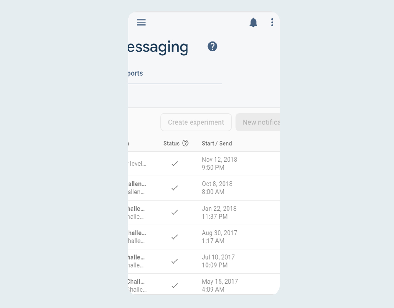
Google Firebase- Mobile UI (text dispersion)
According to Statista, mobile devices account for almost 50% of the web traffic in the first quarter of 2019. With such statistics at the helm, every business existing in the internet domain should consider developing designs that are mobile responsive.
Conclusion
If you’re into starting your SaaS business or are ready to introduce to the world your SaaS product or service, make sure your design team doesn’t take the pitfalls of these common mistakes.
Design is an essential aspect of your business, and it is the first thing that your potential users will see, and that’s where the initial judgments would get made. Avoiding these mistakes will set you on the right path.
Remember that just like the design, sales, marketing, customer satisfaction are aspects of the business that will get better with time. The model requires to serve the functionality of your product or service, and this is the point of utmost importance.

