UX 101: User onboarding and why it is essential for a successful product
Dec 30, 2022

Imagine waking up inside a pilot cockpit, and then getting asked to take charge and fly it to the destination. You’d have no idea whatsoever on how to operate and what any of those buttons, plugs or triggers do unless you already are pilot.
That’s how a user who lands on a new product or service interface feels. Whenever a newcomer uses your product or service for the first time, it is quite common for the entrant to- not find all the features and also get to know how everything works in the first go, even though, for the designer, it’d seem straightforward.
In order to avoid making your users feel hopeless, and then involuntarily driving them to search your product’s “How to” video on YouTube, you could probably help them by providing some intuitive screen guidance and a little hand-holding in the form of user onboarding. Also, don’t forget that you’re possibly saving your product from being discarded by the user.
What Is User Onboarding?
User Onboarding aims to achieve customer success; in simpler words- To facilitate positive user experience, which is crucial to a user’s journey. A well-planned user onboarding allows businesses to communicate their value strategically.
User Onboarding essentially is a series of screens or organic transitions that guide users through the functionalities of the app or web interfaces. There are multiple types of onboarding methods you could implement, depending on the nature of the digital product in your business.
Types of Onboarding
The principal purpose of user onboarding is to educate users on the functions and benefits of the product or service. The task is to provide a smooth experience that lets you establish a relationship with the user that’ll let you obtain profile data, which can be used to deliver personalized content and notifications.
The 3 most common types of onboarding are:
1. Value-Oriented Onboarding
Pretty much as the name suggests, this kind of onboarding uses screens to demonstrate the value or benefits of the product or service to the users. The primary focus is to explain what the app does than guiding through on how to use the app. The onboarding screens might also include permission-request prompts to enable app notifications and get access to other device services.
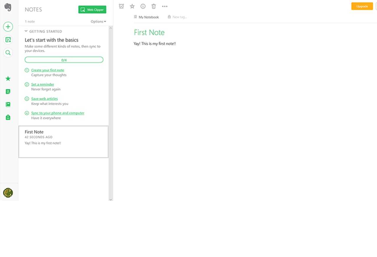
Evernote- Value-Oriented Onboarding
Evernote, through a very interactive checklist, established the value it will provide to the users with its functionalities. It also uses beautiful modals to occasionally display information and prompts to add its extension to your browser.
2. Progressive Onboarding
It’s more of an interactive approach where the user walks through different screens and instructions sequentially. It is a relatively extensive method where the user learns to use the product or service and also explores it simultaneously.

Progressive Onboarding: Two Dots
Here’s an example of a casual mobile gaming app, Two Dots. Stepping away from the traditional user onboarding techniques, Two Dots provides the user with instructions gradually and respects the time required for absorbing the information. The user performs play-through activities as part of the onboarding. After completion of each step, the user gets to practice it at least one time before moving on to the next set of steps.
3. Function Oriented Onboarding
Here, the approach is to drive the user’s attention to the functionalities offered by the product or service. The user gets a virtual tour through a series of screens. Technically, focusing on the functionalities.
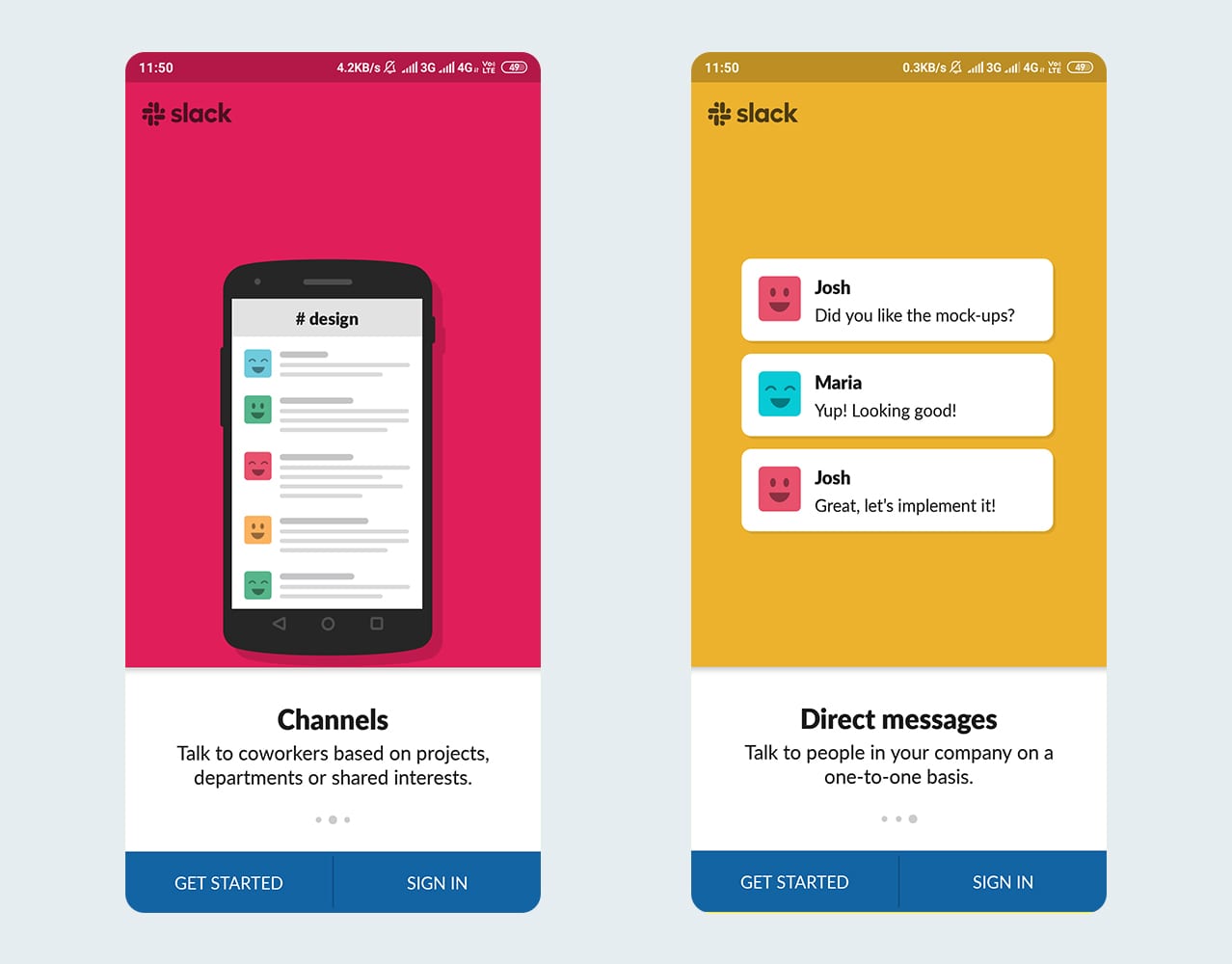
Slack- Function Oriented Onboarding
Now that we know what user onboarding is, let us understand why it is vital to every product or service-based business. In the following part of the article, we’ll look at the key-factors that sum-up to make user onboarding an essential part to better user experience and how it affects business’ revenue if done right.
Now that you have a basic understanding of user onboarding, let us look at key reasons that make user onboarding an essential part of UX.
Key Reasons why User Onboarding is Essential
Gives User the Motivation to Use Your Product
The moment you identify that the user is getting a value from your product, you know that he/she has seen that there’s an achievable potential from using your app/service. At the moment, attempting to establish a goal for the users goes a long way as providing users a goal gives them motivation and adds a data point for retention.

Here’s an example from the app- Duolingo (language learning application), which uses a series of screens that prompt questions to collect information regarding the user’s motivation behind learning a language. They use this data to provide their users with a tailor-made experience.
Improves User Retention by Hooking the User to the Product
Andrew Chen, a start-up investor from Silicon Valley said in an interview that spot-on user onboarding is the best way to bend the retention curve. 77% of the users abandon an application within the first week of its download. Apparently, there’s only a 20 seconds window to make an impression on the new users.
Hence, the team must put an effort into a direction to create a UX that becomes indispensable for the users. Here’s an example from Headspace, a meditation app.
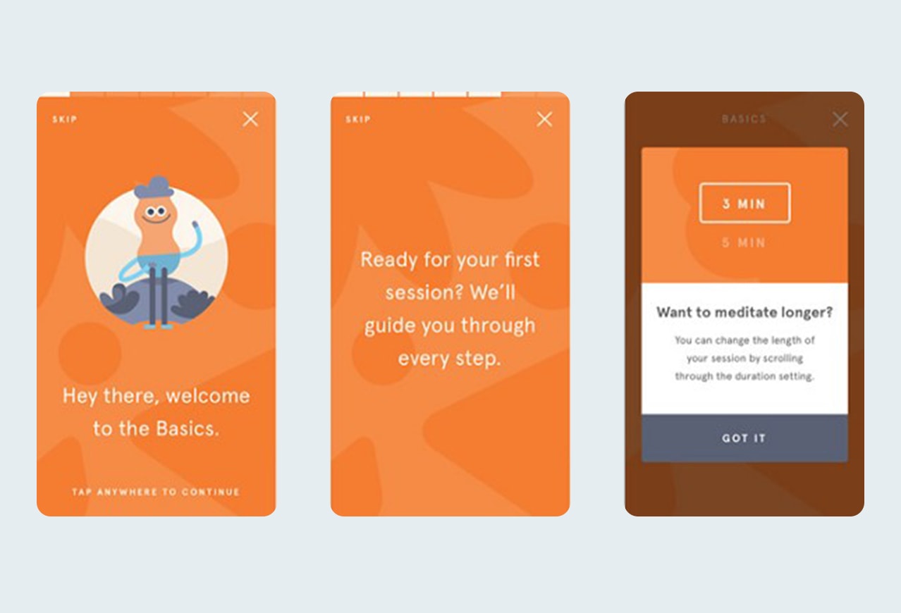
Headspace uses a combination of enticingly good copies and progress bars to introduce the user to the idea of meditation sensitively. Progress bars impact users psychologically as it helps them remain informed & engaged, slowly building a sense of excitement.
If you’ve been a part of the mobile app space, you’d know that app installs or user acquisition were one of the most important metrics for analyzing app performance. However, the fickleness of users was unaccounted for, and soon did the marketers realized that relying on this metric alone is not going to work.
21% of the acquired users, use the application only once, and 71% of them churn out in 90 days. With the ability to collect location-specific data, the focus shift from user acquisition to user retention was inevitable.
How could addressing retention issues help improve revenue?
A study inspired by CEOs of 300 global retail and media executives found that an increased effort in keeping your users happy resulted in a likely increase in revenue by 25-95% over the period of three-years.
The three main findings behind why retention improves long-term revenue prospects are:
- The retention-focus approach drastically decreases the churn rate, which in turn means that the business requires few new acquisitions. Also, lowering the Customer Acquisition Cost (CAC).
- Loyal customers tend to spend more. According to a study by Echo in 2012, loyal customers are 12% more likely to spend on continued products and services. Three out of four believe it is a history of positive experiences with the customer.
- Increased Customer Lifetime Value (CLTV) is directly proportional to the increase in revenue.
Reduces User Churning by Simplifying the Product
User Churning is inevitable, but it’s addressable, especially when the reason is that the user is struggling to use the service/product.
Here’s an example of Reddit, who completely redesigned their classic look:

Reddit Old Design
Vs

Reddit New Design
Steve Huffman, CEO, when asked about the reason for the redesign said that it was necessary since users who visited Reddit for the first time were utterly lost and one of the reasons for this was the classic design. Reddit has a loyal and passionate user base; there are subreddit and an active community for almost every topic out there in the world.
As stated by Steve, the increasing churn out of new users caused them to redesign. Simultaneously, a lot of already existing users criticized the new design when it came out, so keeping in mind these loyal user’s opinions, Reddit provided an option to switch to classic design if needed.
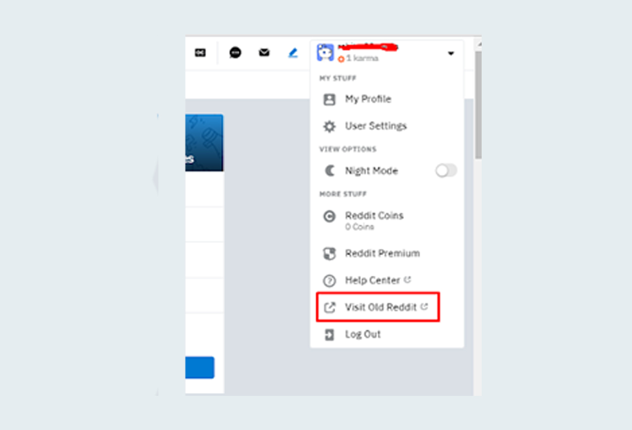
Click on the highlighted button to switch to Old Classic Design
Use Continued Engagement to Make Them Come Back to You
It is equally essential to maintain the initial excitement towards the user. Not doing it will be planting seeds for the user churn. Ensure that the customers stay longer and advocate your service’s use.
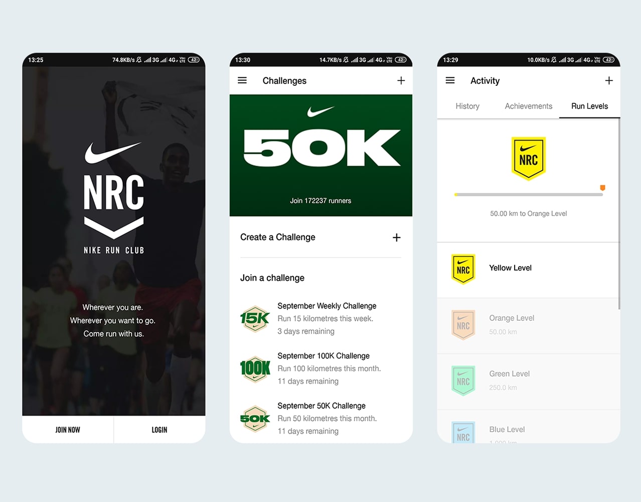
Nike Run Club- Gamification
Nike Run Club, a fitness-centric social network application, aimed to motivate users to get to the next level of fitness. It uses physical body information to build customized nutrition and workout plans, and then it rewards users with badges and points on achieving targets. It also allows users to connect with friends and families and track their progress to keep them engaged and at the same time motivate them by offering healthy competition.
In-app quests, achievement unlocking, badges, fitness goal trackers are a great way to acquire new users and keep existing users engaged.
Conclusion:
By now, it’s more than evident how important user onboarding as a process is to the business’ product or service. We’ve classified three principal reasons why User Onboarding is inevitable based on the benefit it generates:
1. Users Come Back for More
Fulfilled and satisfied customers are more prone to repetitive usage due to positive history buying from you again and becoming repeat customers than unhappy ones. Repeat customers are the most valuable asset to any business. They push up your retention rates and, consequently, bringing in more revenue.
2. Happy Users Refer to Friends
There exists no form of marketing better than word-of-mouth marketing (WOM). It happens only when your users are most satisfied with their experience, and in such cases, they tend to recommend your product to people in their network. It’s also free marketing.
3. More Revenue
An outcome of the benefits, as mentioned above. By making users always come back, you’ll be making more money without investing heavily in outbound marketing for new acquisitions.

