Overview of Health-e
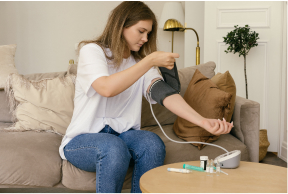
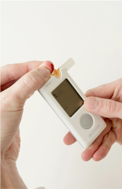
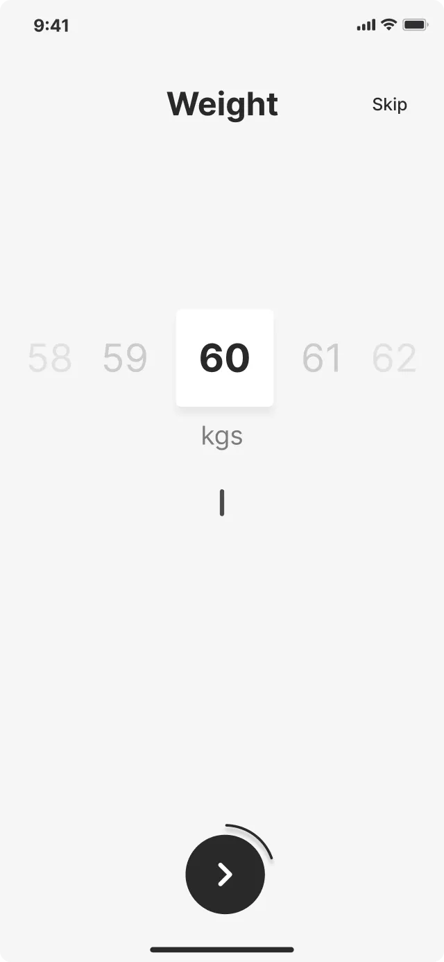
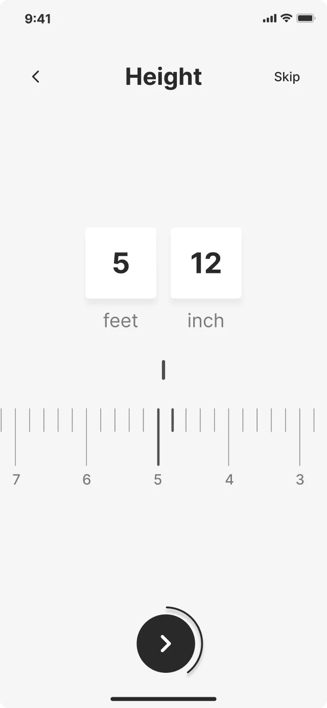
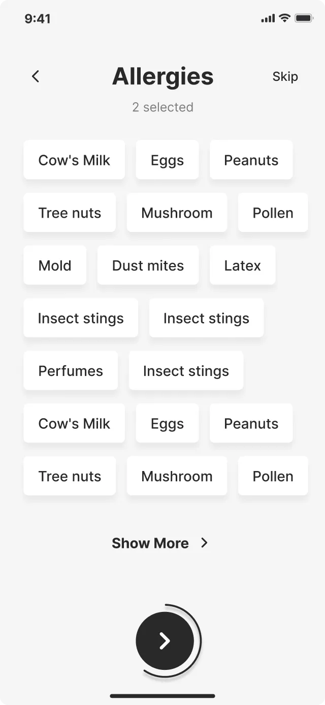
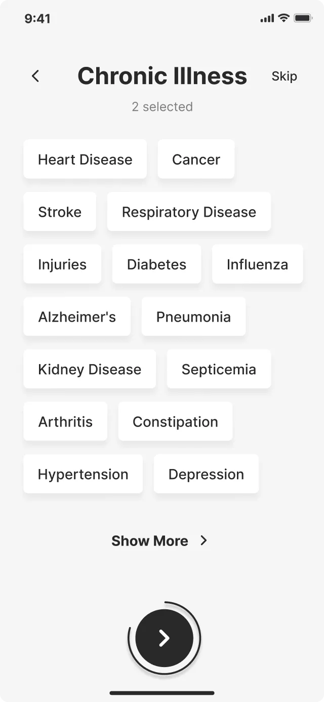
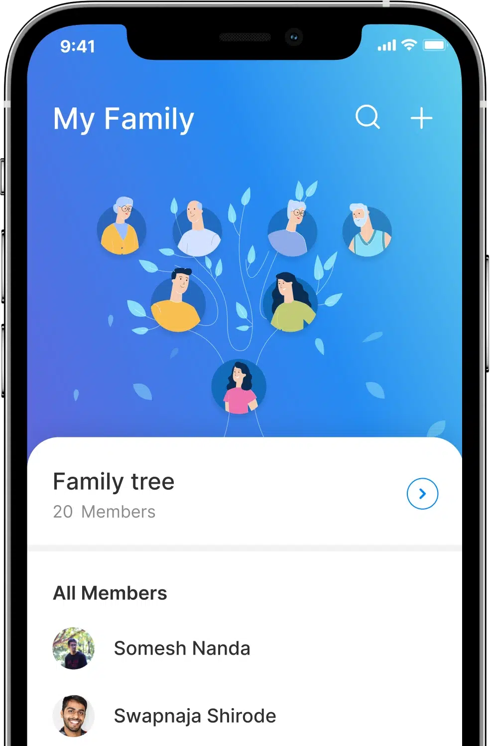
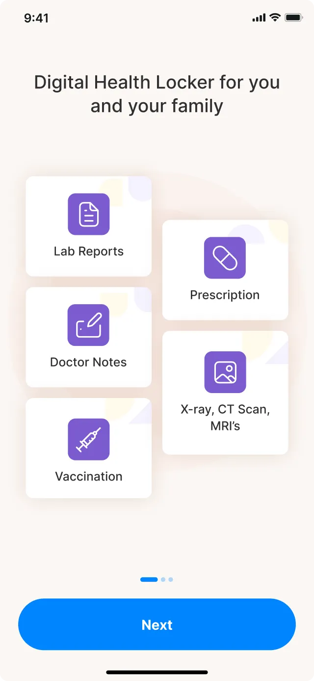
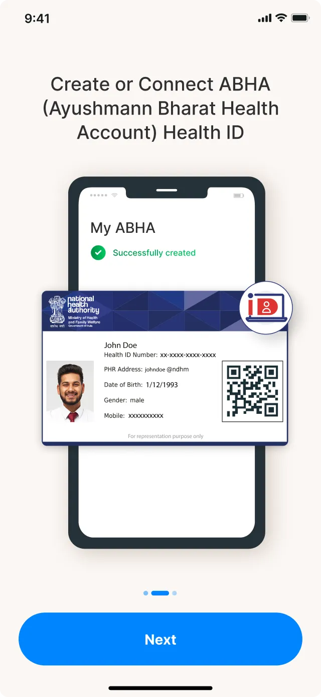
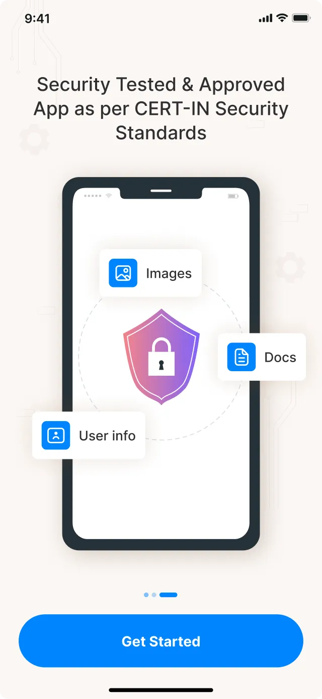
Health-e is an innovative healthtech platform that brings medical records to the digital realm, empowering individuals and families to take control of their well-being. The idea is to seamlessly integrate medical records and provide valuable insights into general medical parameters for all its users. Health-e turned to UXTeam with the idea for the healthtech UI UX design.
-
Industry
healthtech
-
Platform
iOS and Android
-
Location
India
-
Services
Design Strategy
UX Design
UI Design
Challenges identified by Health-e
-
Data overload
The cumbersome task of carrying physical copies of medical records everywhere
-
Sharing records
Frantically asking friends and family to snap photos of records during emergencies
-
Disorganized files
The disarray of storing and sharing medical information as the data increases
Insights from the collaborative discovery sessions
Discussions with company stakeholders enabled us to outline the essential features and functionalities for the Health-e mobile app ux design. Our findings revealed some user insights:
-
People are accustomed to store and share medical records in an organized and unreliable way
-
People use third-party apps like WhatsApp, Telegram, and WeChat to share their medical data
-
A user-friendly experience is a must to engage users to share and store medical data using Health-e
Structuring user journey through wireframing
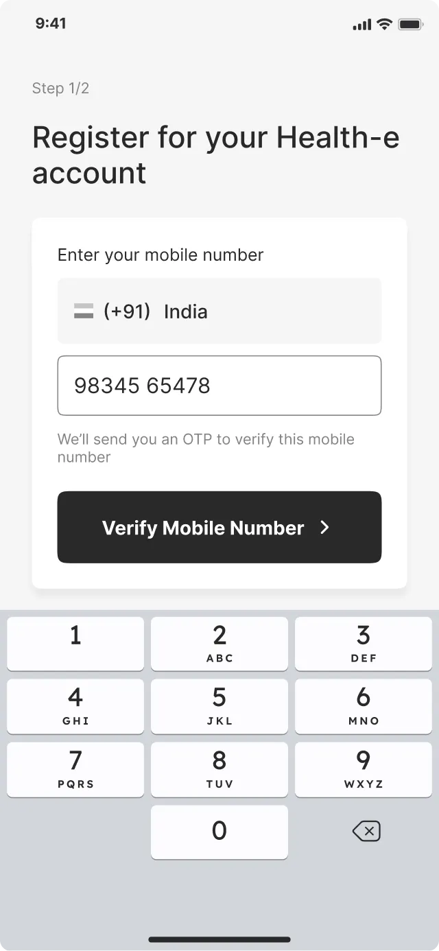
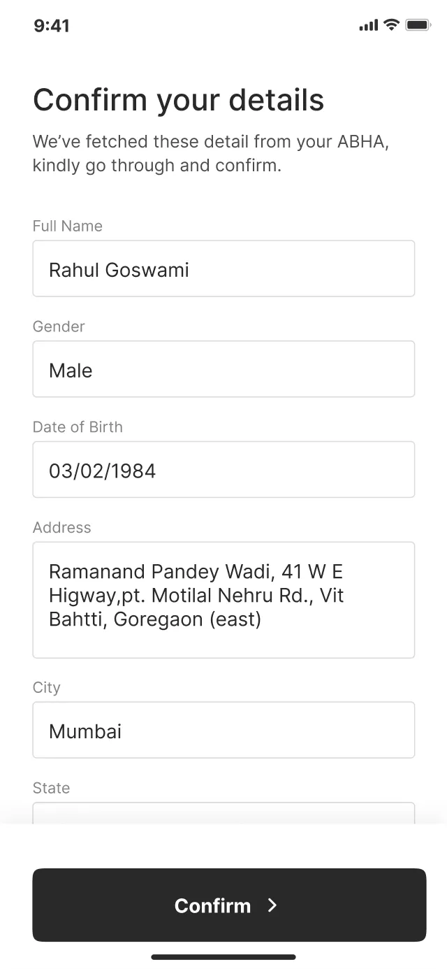
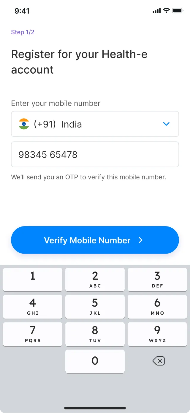
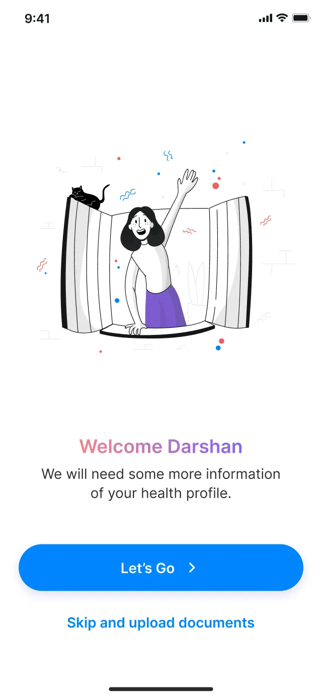
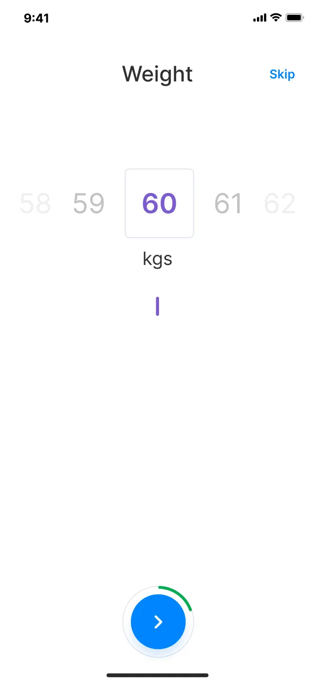
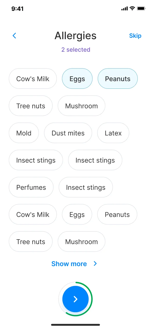
We created wireframes to visualize the platform’s layout and structure, providing a clear representation of its navigation and user interface. Wireframing helps us to identify potential usability issues that can be addressed before development begins, resulting in a more user-friendly experience.
Setting the visual tone
We meticulously crafted a visually appealing and accessible interface that not only aligned with Health-e’s brand identity but also resonated with users. By experimenting with various color schemes, typography, and design elements, we were able to strike the perfect balance between aesthetics and functionality.
Throughout the design process, we maintained open communication channels with stakeholders, incorporating their feedback to refine the visual design further
Key screens
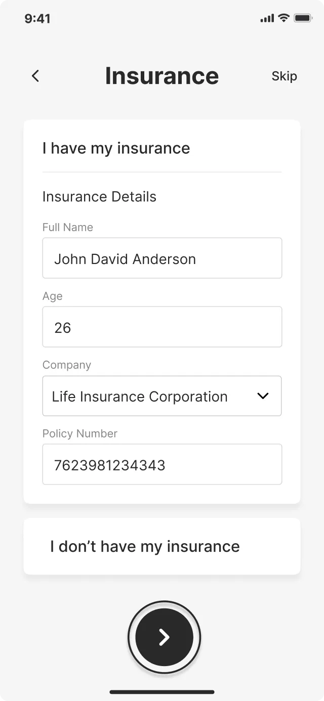
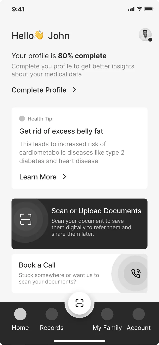
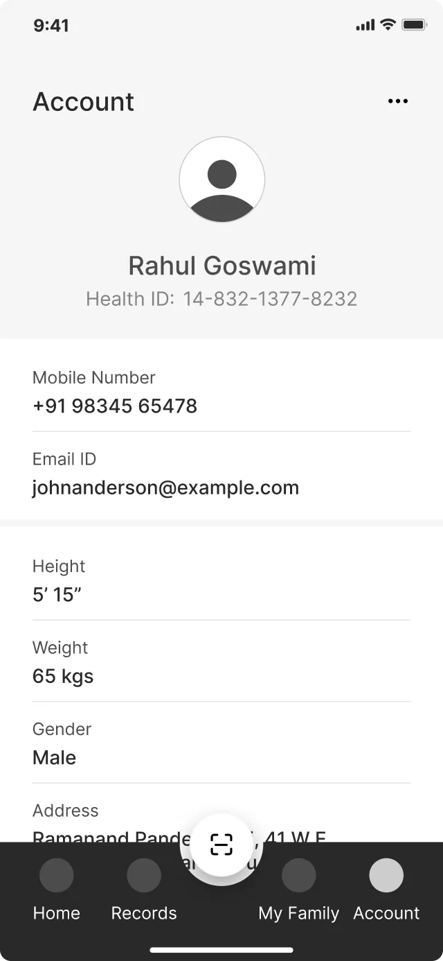
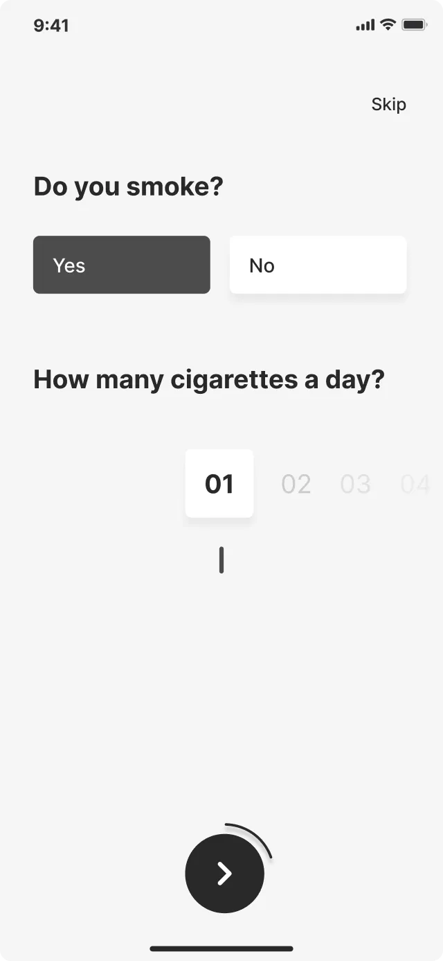
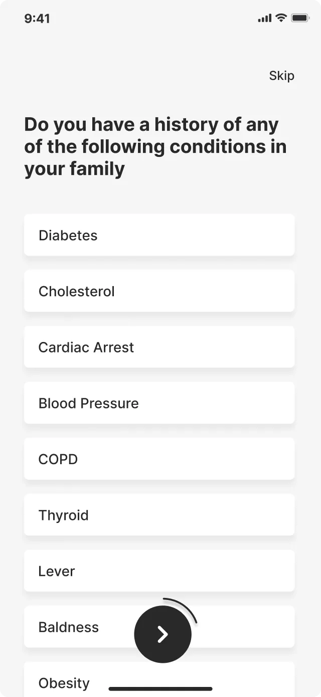
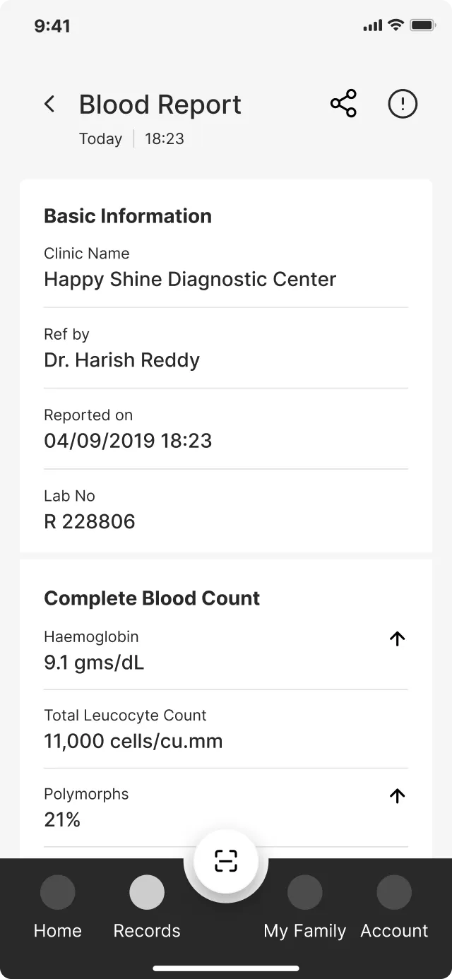
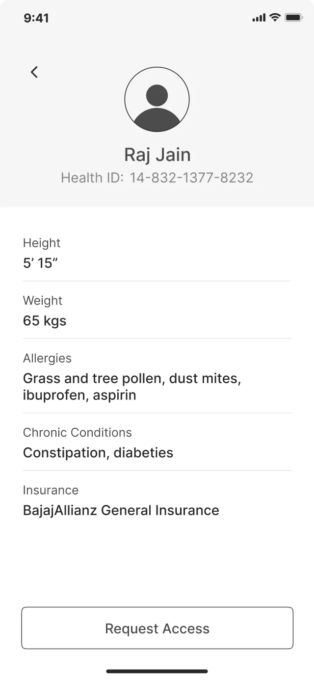
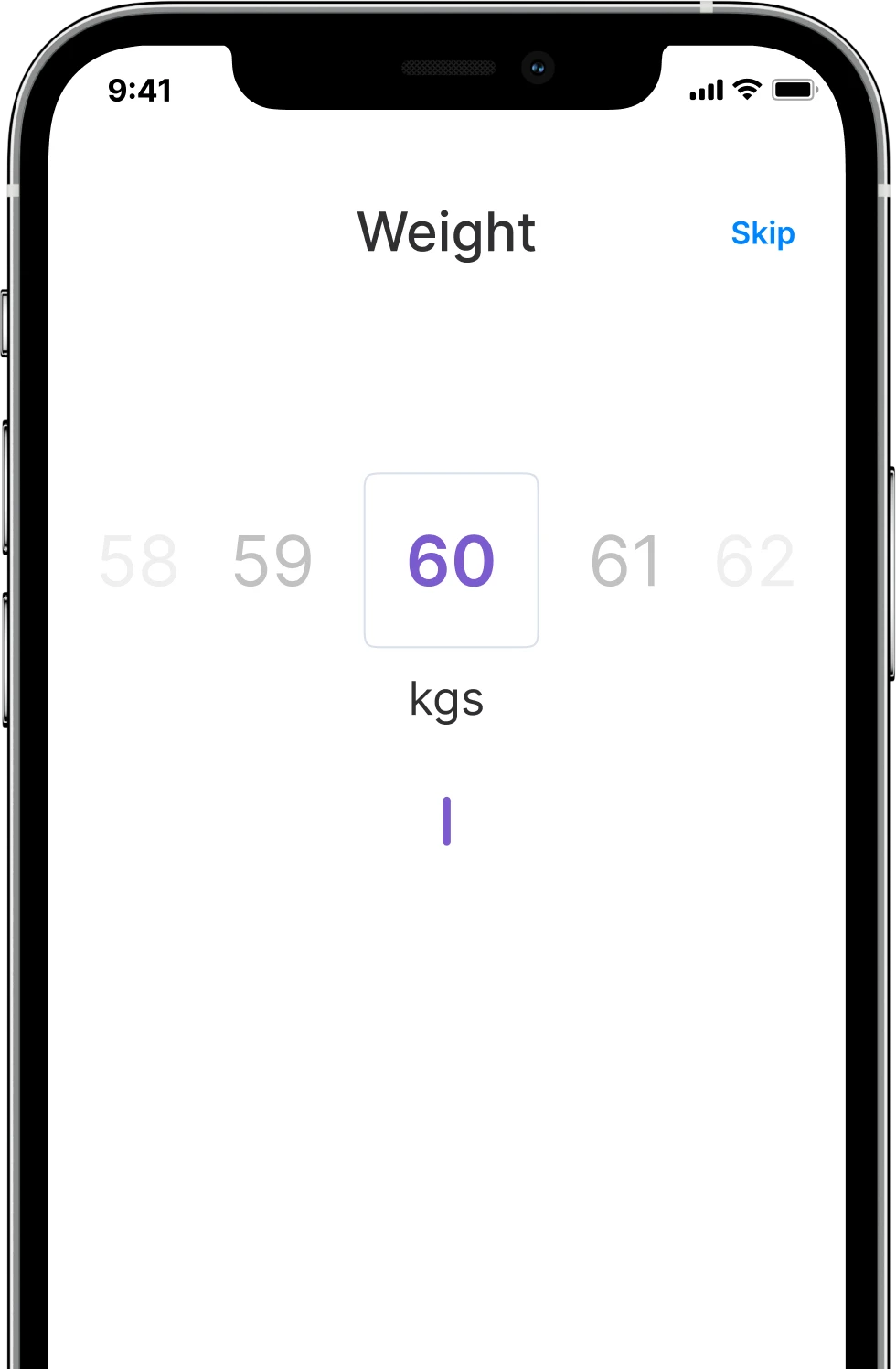
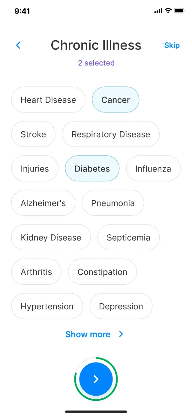
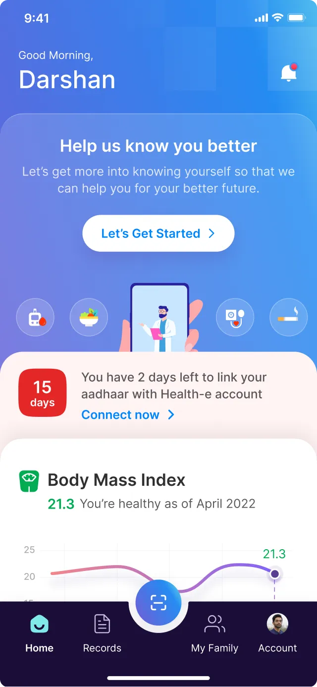
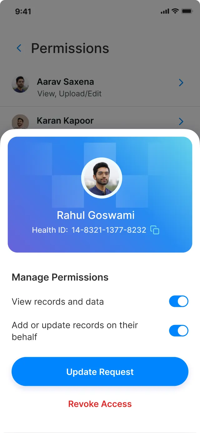
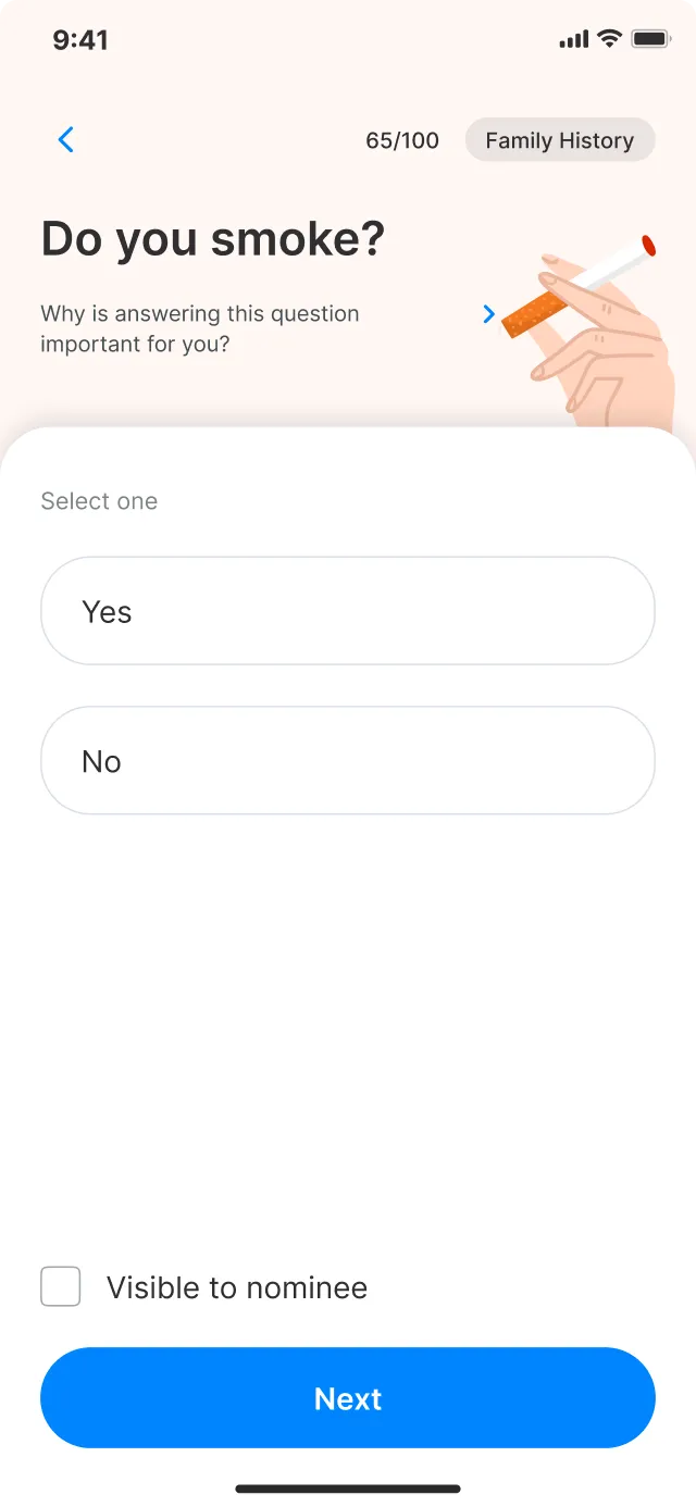
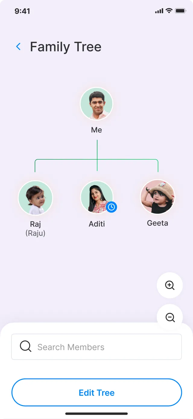
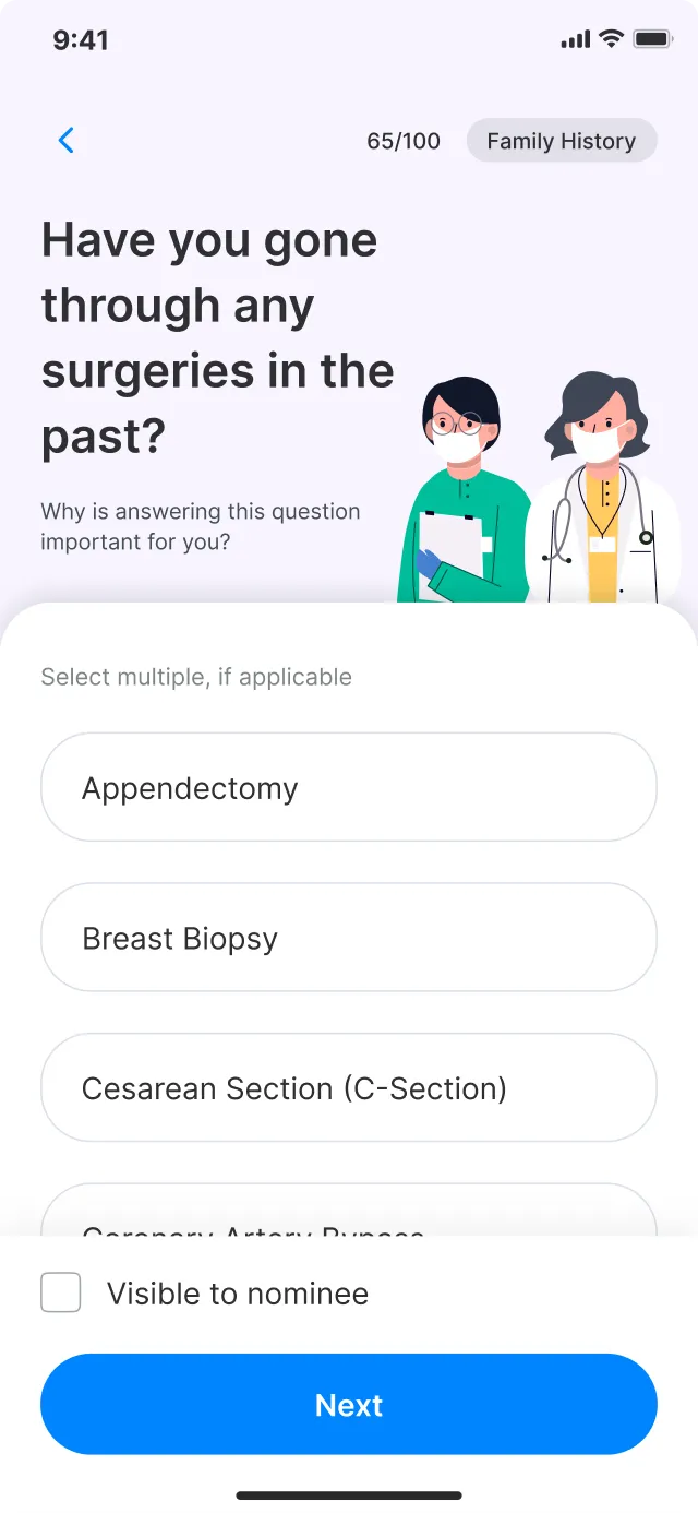
We effectively addressed the challenges of Health-e by incorporating the following key screens
-
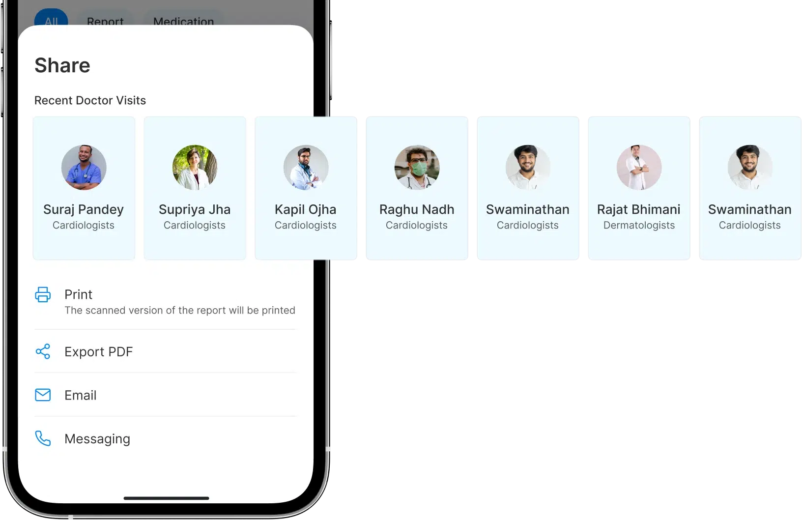
Effortless sharing with
doctorsSimple one-click sharing feature allowing users to swiftly share their reports while maintaining full control over their medical data.
-
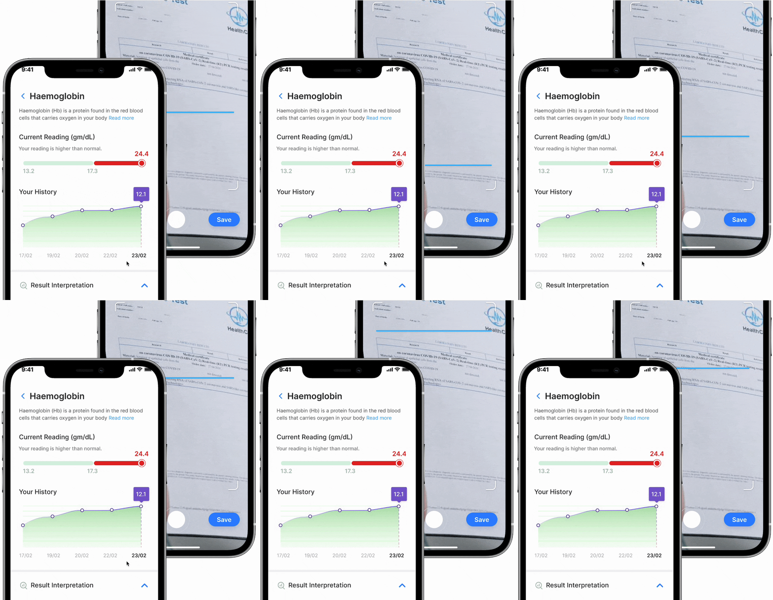
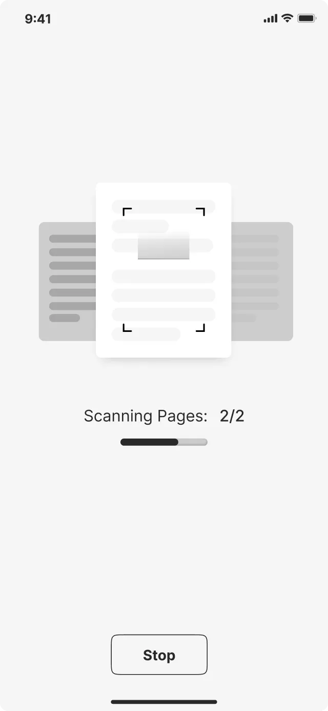
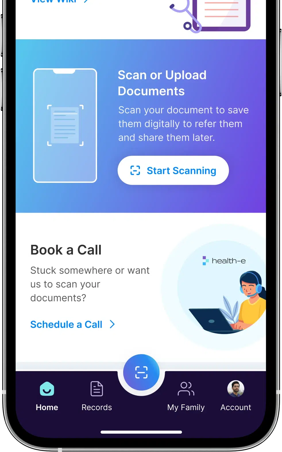
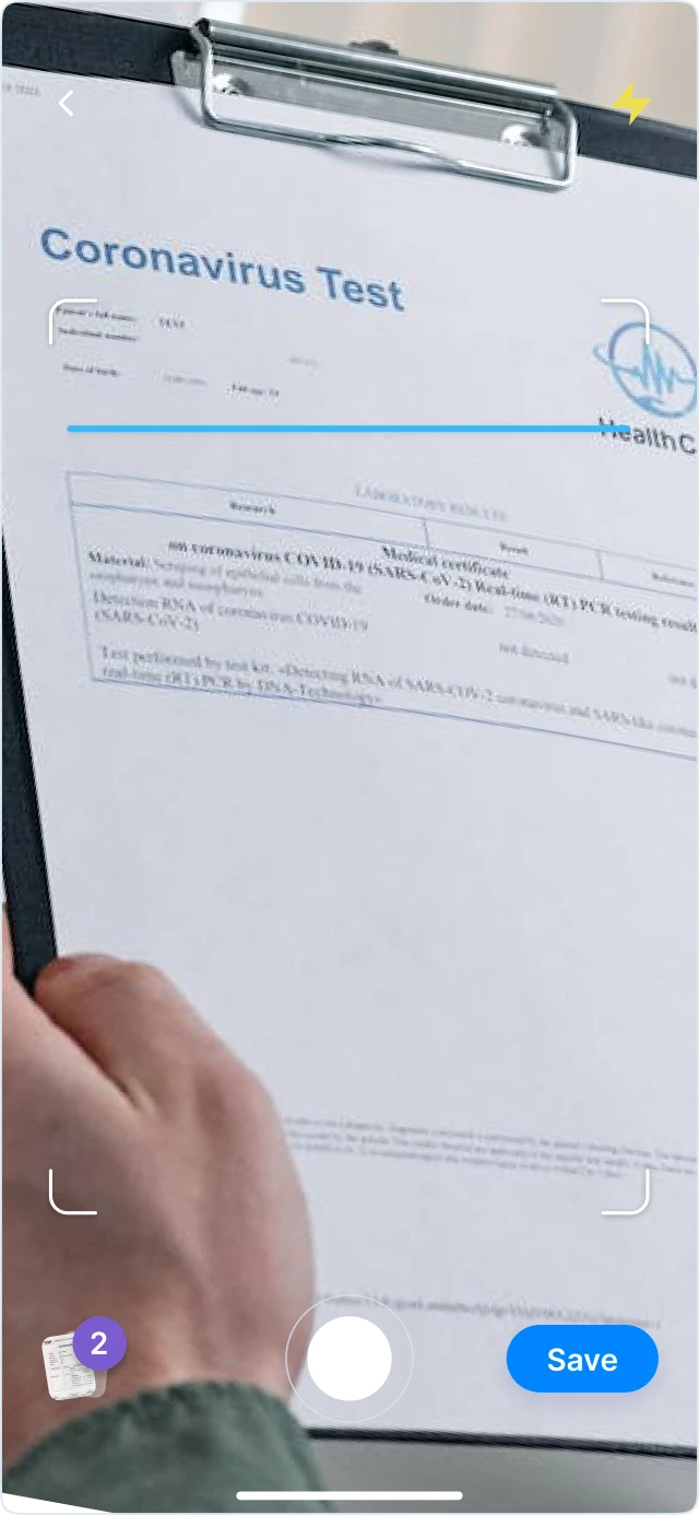
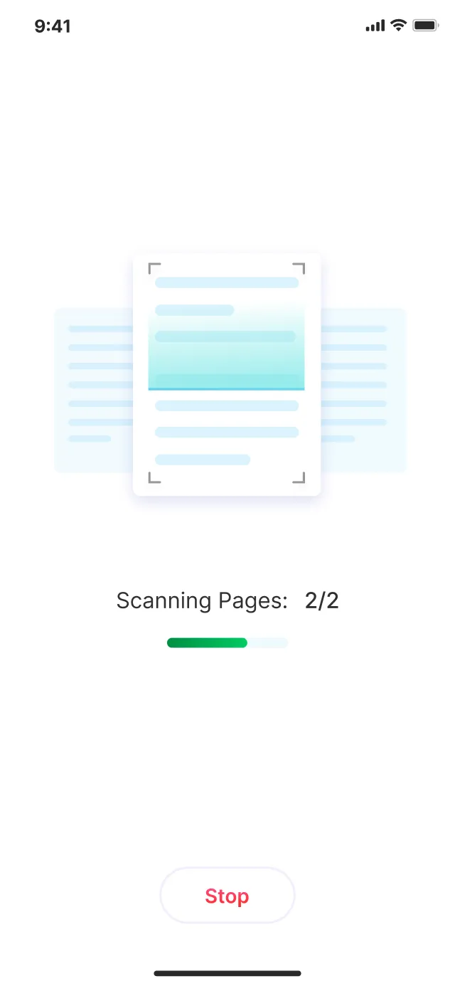
Paperless record storage
By implementing OCR technology, users can directly scan the physical medical copies and store them digitally.
-

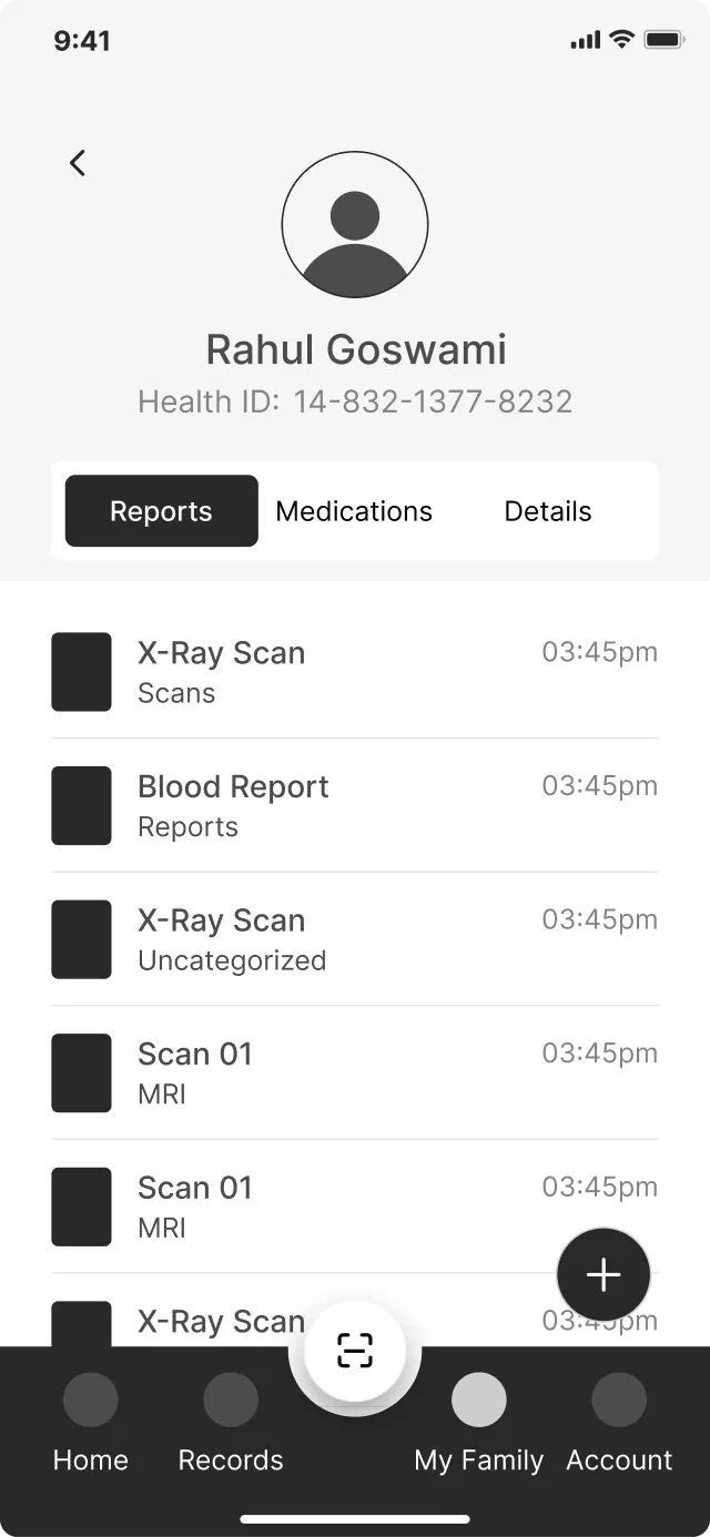
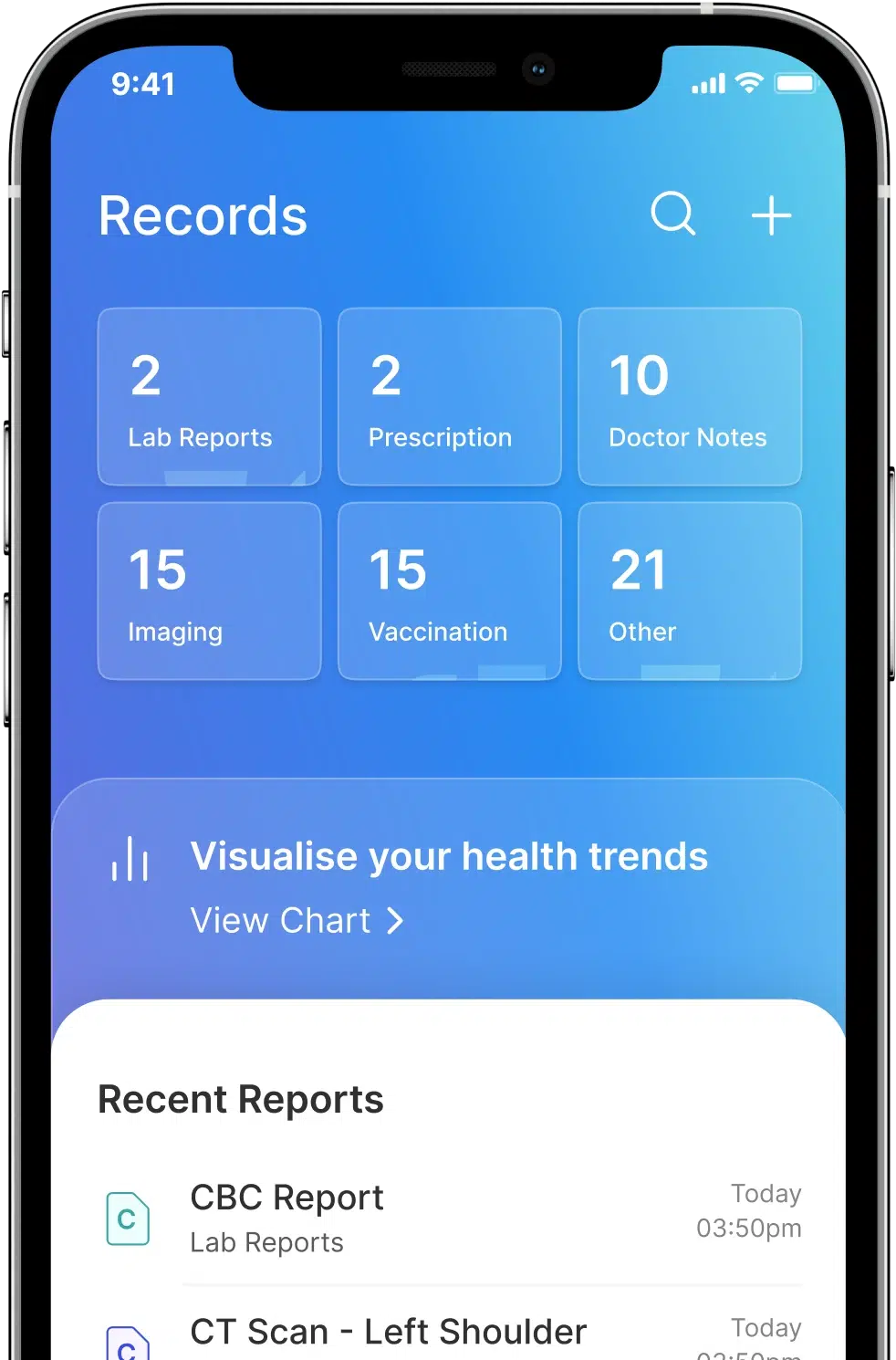
Streamlined record access
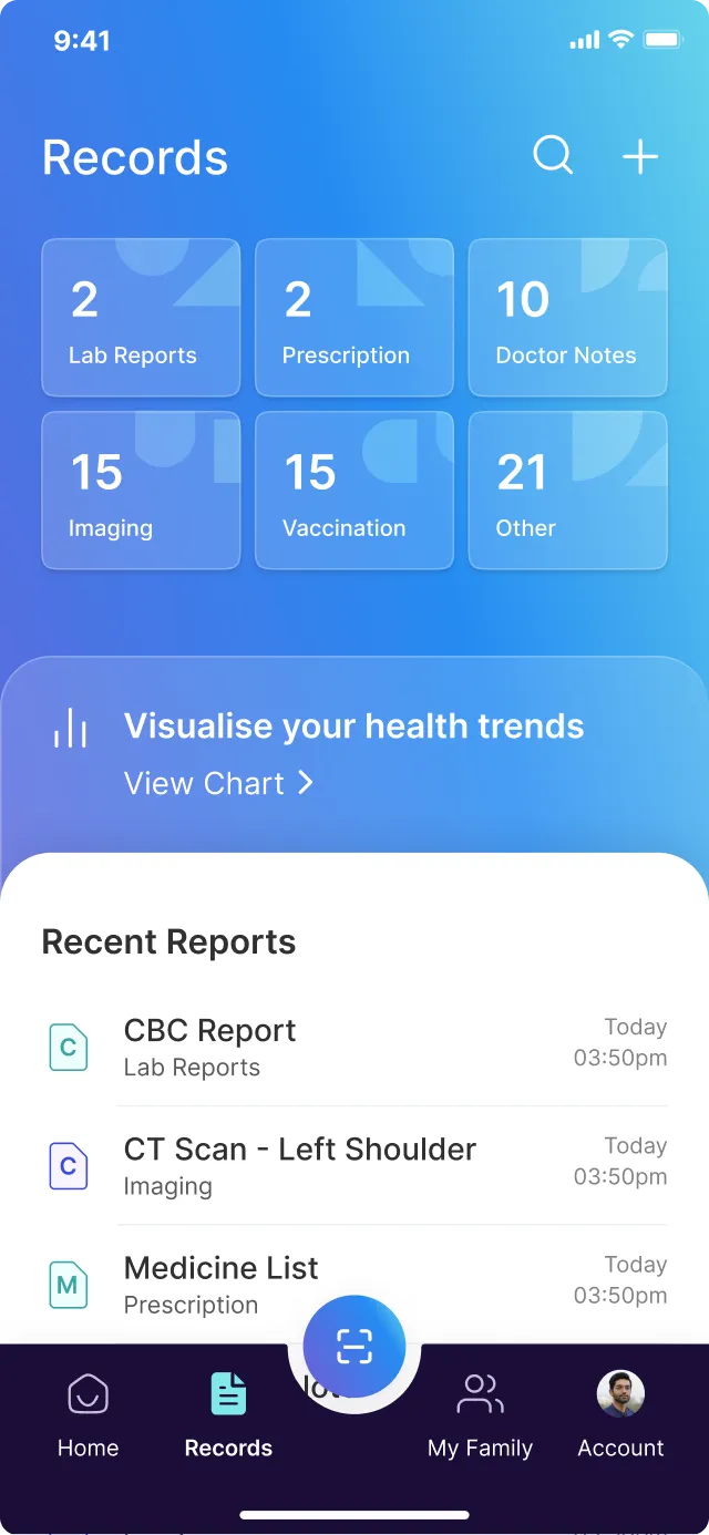
Organized folders to swiftly locate the precise reports that users need.
UI kit
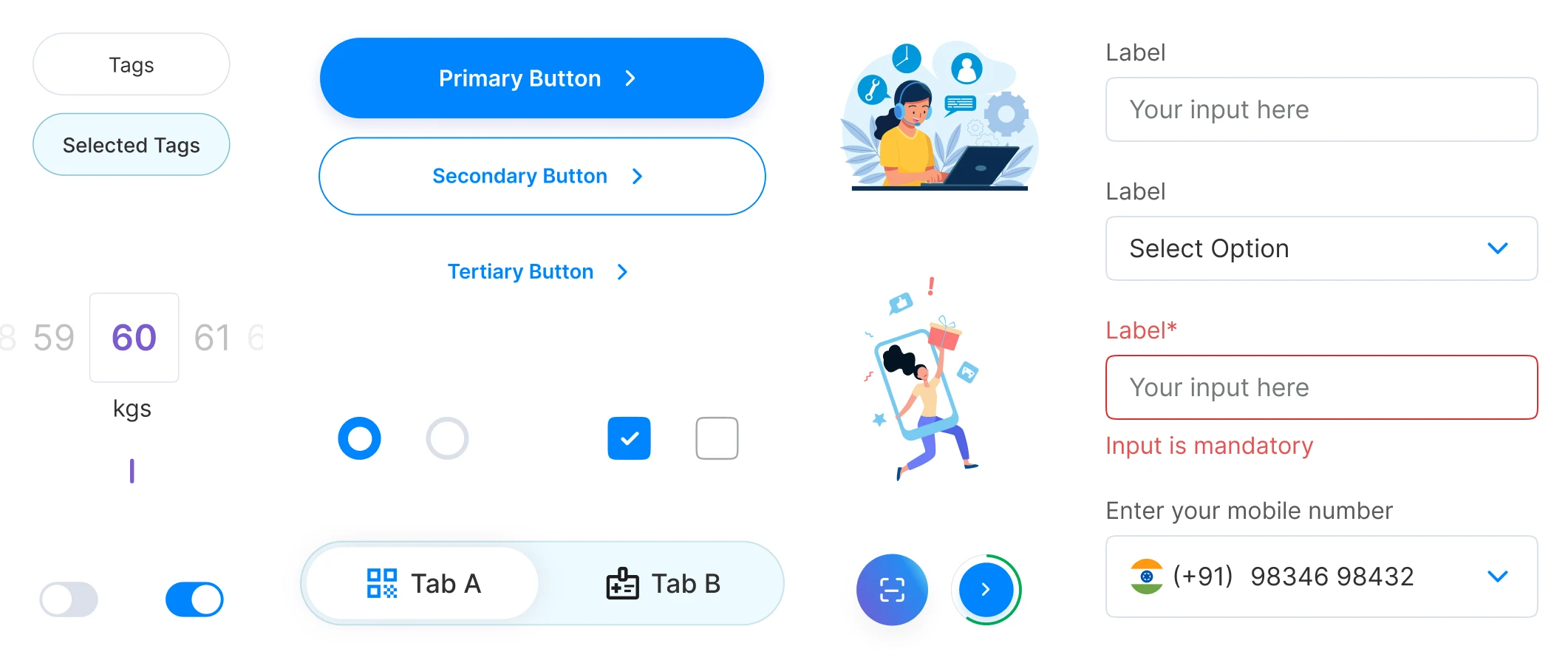
We created UI Kit to ensure consistent visual design and user experience across the platform. With a UI Kit in place, it becomes easier to scale the platform by adding new features and functionalities while maintaining the established design language.
-
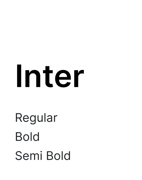
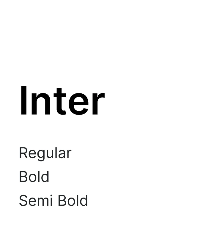
Typography
-
Colors


-
Components

What we delivered
Several revisions and Zoom calls later, we delivered the final designs with confidence.
-
250+ hrs
Focused design work
-
50+ hrs
Discovery sessions and
feedback meetings -
100+
Screens designed
Health-e
The live app received an overwhelmingly positive response, garnering thousands of downloads across India and stellar reviews on the Google Play Store and Apple App Store.
-
50k+
downloads in
5 months -
4.3
ratings
We are thrilled to have built something that meets the user needs.
-
Wonderful app. Scans your lab reports and digitizes it with interactive details about your health.
-
Best app to store all medical report at one place , and also have other interesting medical releted features. I highly suggest to all of you to use this app.
-
Very Good App, It is future of health care system, Government also work on these types services..Feel free from hard copy storage of medical reports/files, it is very useful for health conscious persons also..
-
Great app now I can store my all medical record at one place hassle free and show to my doctor when I go to checkup
-
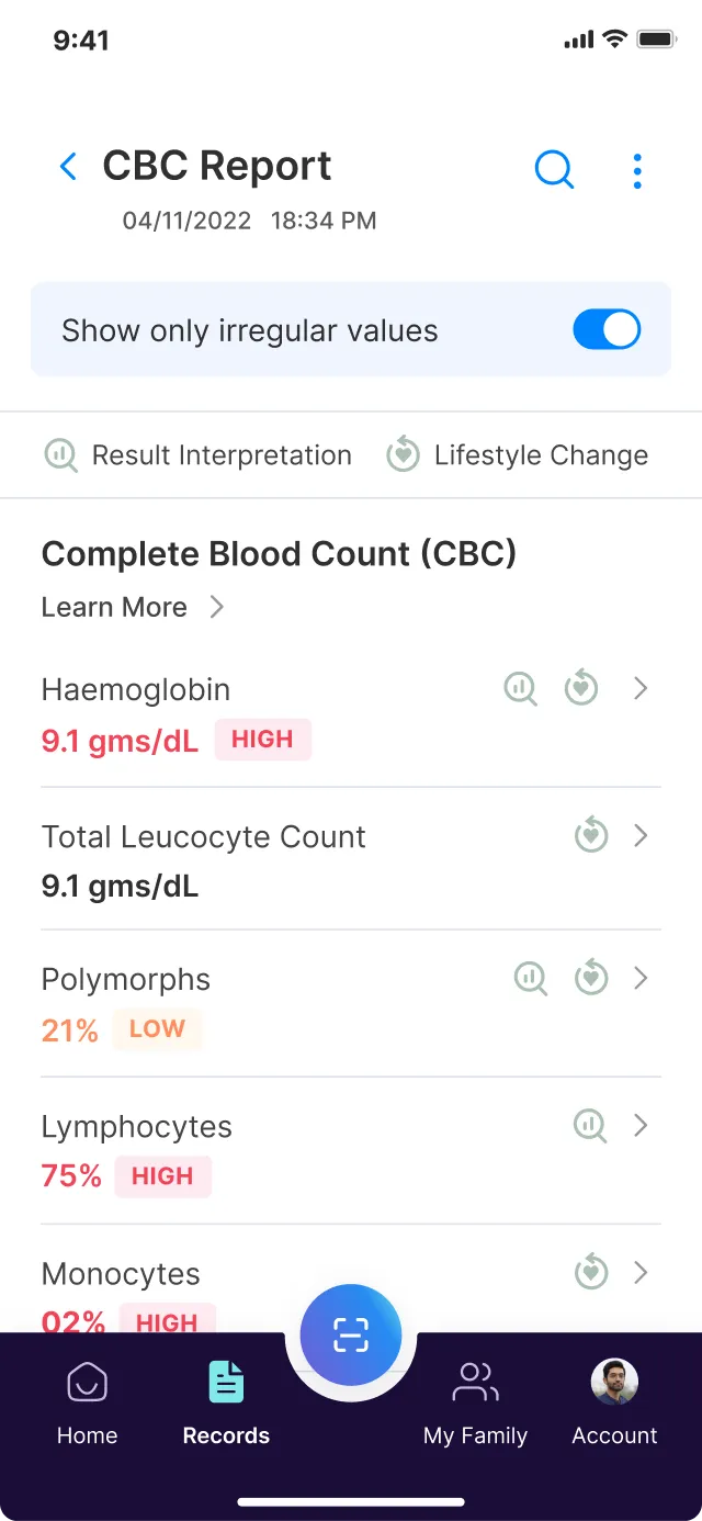
Good app keep tracks and highlights hign or low values
-
This is a great app that lets you store all your medical reports and makes it easily accessible. The reports are easy to read and understand by a non-medical person as well.
Have a healthtech project or idea in mind?
Let’s connect and understand how we can collaborate to take it to the next level!
