


Overview of the project
In this case study, we will analyze the effectiveness of Handtyped in maintaining a personal touch in digital communication by examining its solution of creating a personalized digital keyboard from the user’s handwriting. We will evaluate the results in terms of user feedback, usage data, and other measurable outcomes to gain insights into the impact of Handtyped on enhancing communication.
-
Industry
Utility
-
Platform
iOS and Android
-
Location
USA
-
Services
Design Strategy
UX Design
UI Design

Challenges while designing Handtyped
-

Same boring fonts
There were many apps were which provided same default handwritten fonts to their users.
-

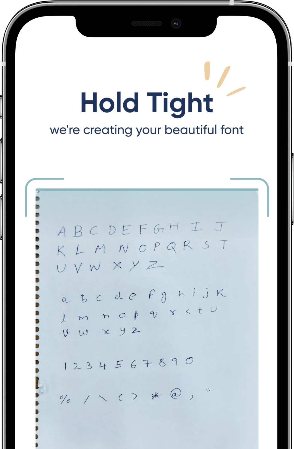
Hard to create personalized font
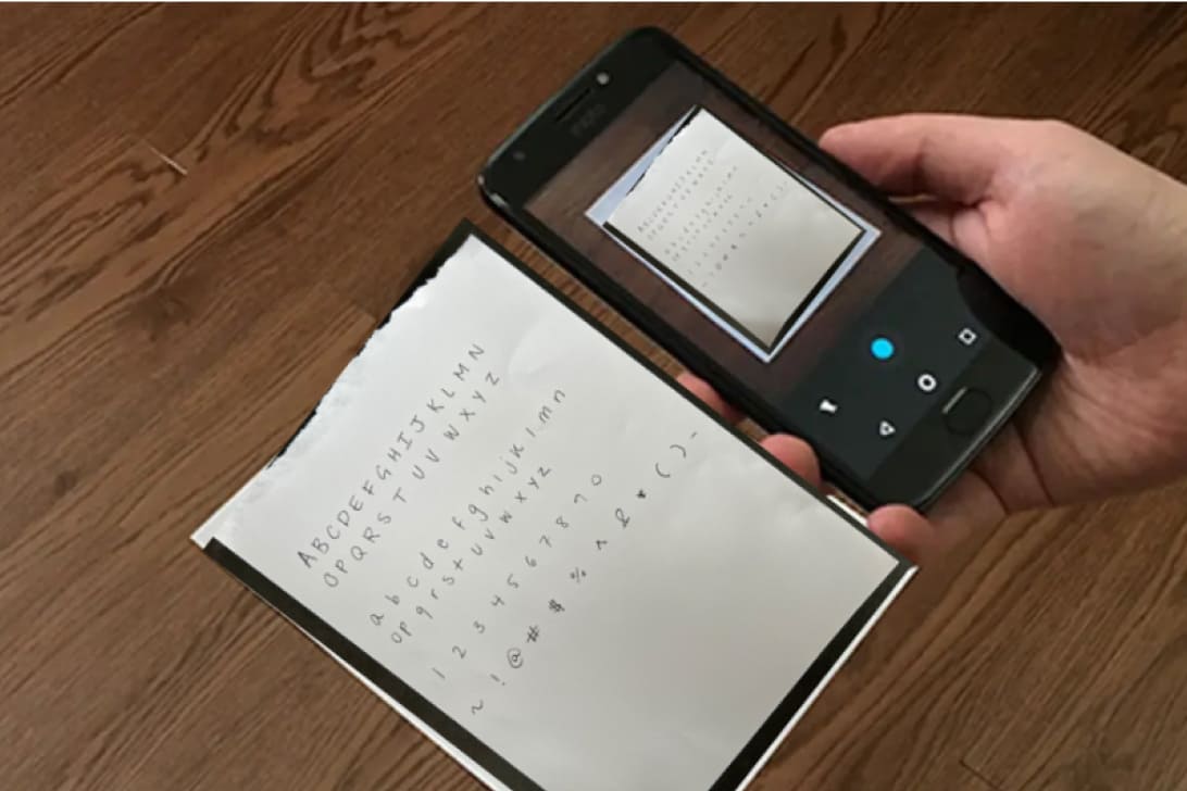
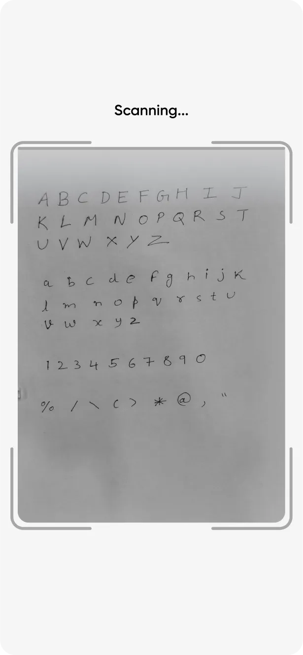
Other apps used finger tracing to create fonts, resulting in dissimilarities between the user’s handwriting and the final product.
Insights from the collaborative discovery sessions
We developed a user flow aligned with Handtyped’s vision for the app, including brand guidelines and an overview of the product. Key insights included clear instructions for creating personalized fonts using handwriting scanning technology and consistency with the brand’s color palette.
-
We developed a user flow that aligned with the client's vision and goals for the Handtyped app, based on the clear brief they provided.
-
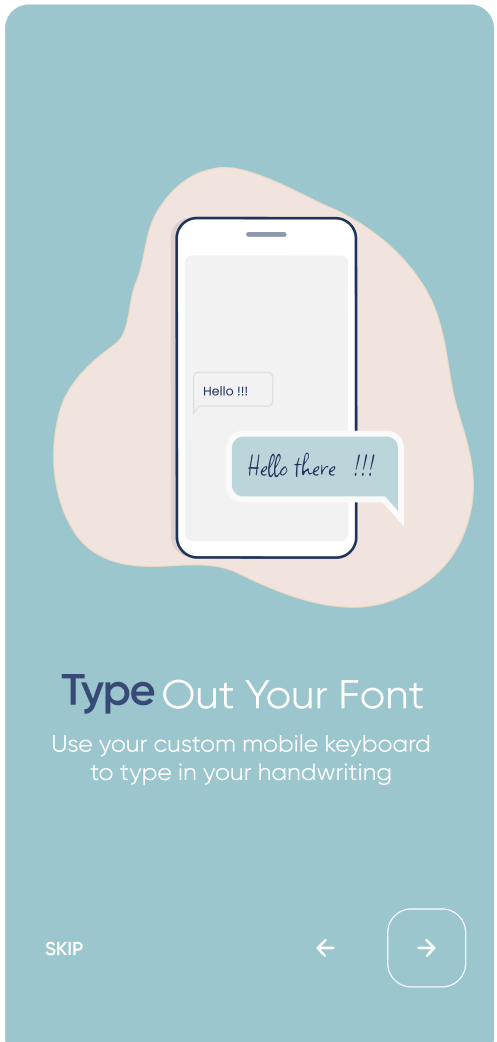
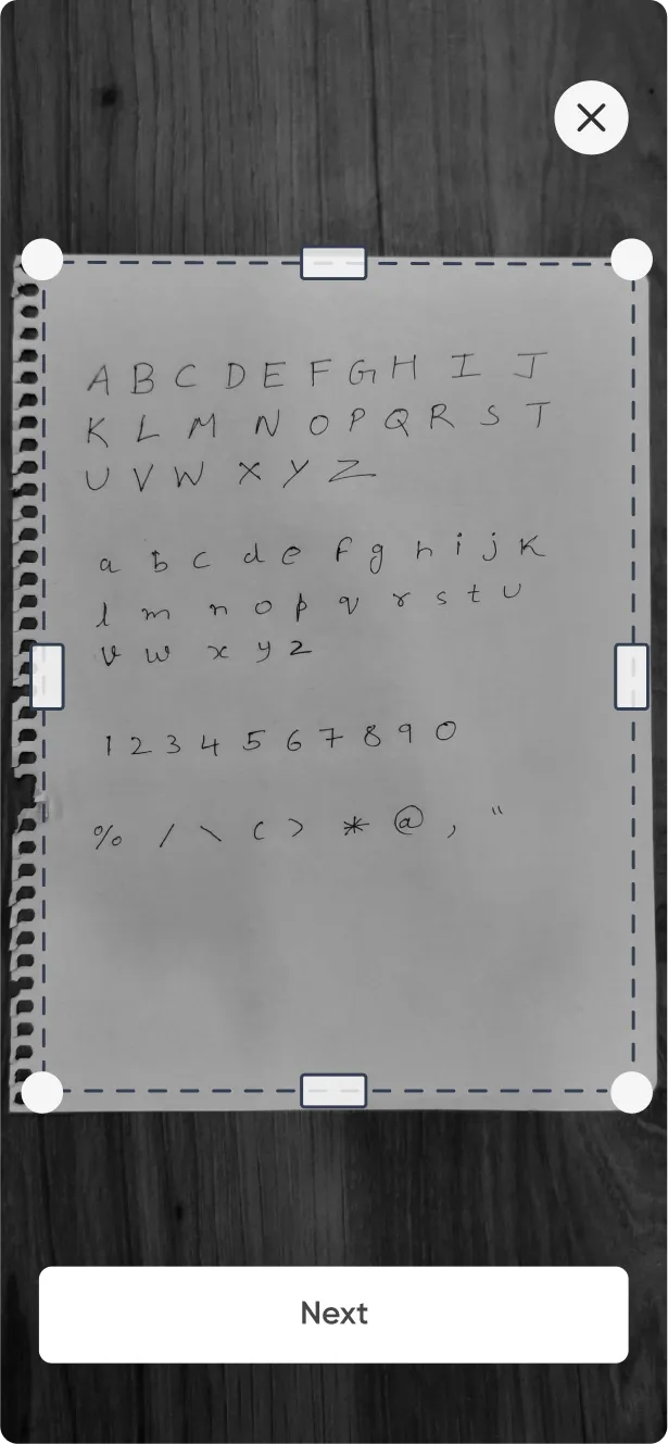
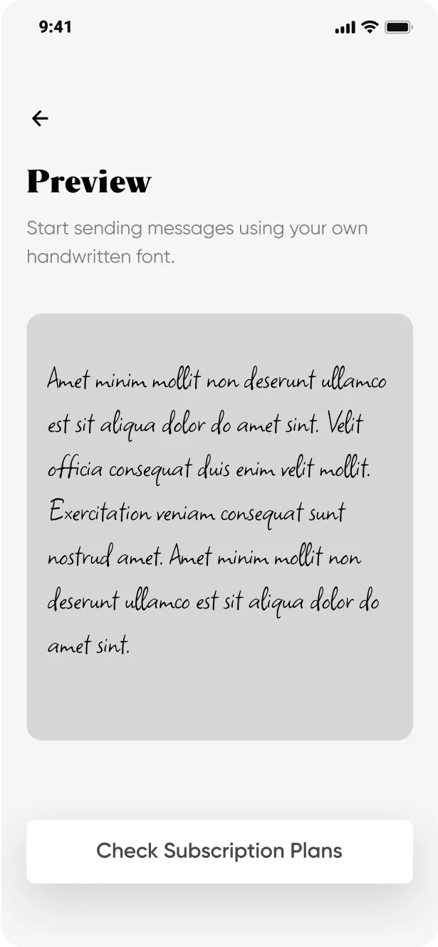
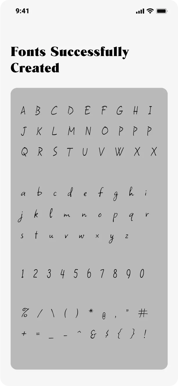
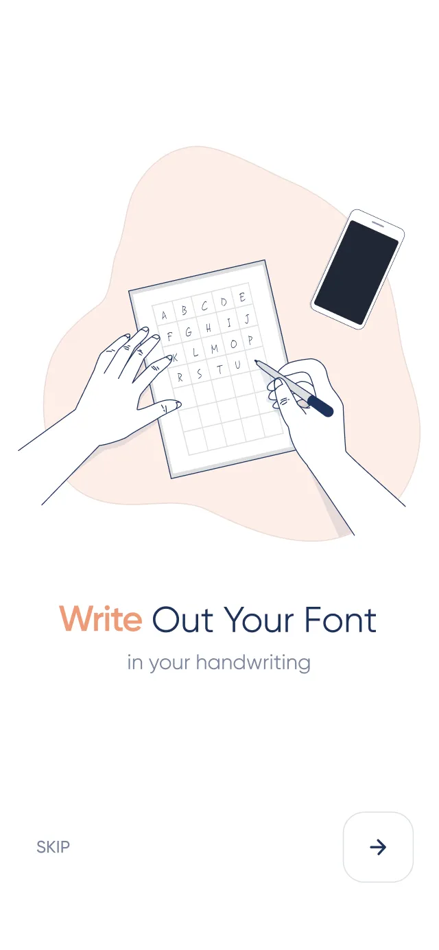
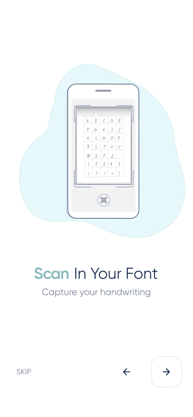
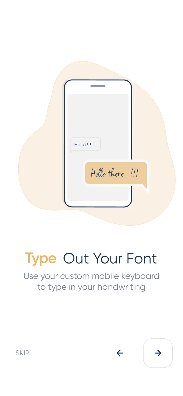
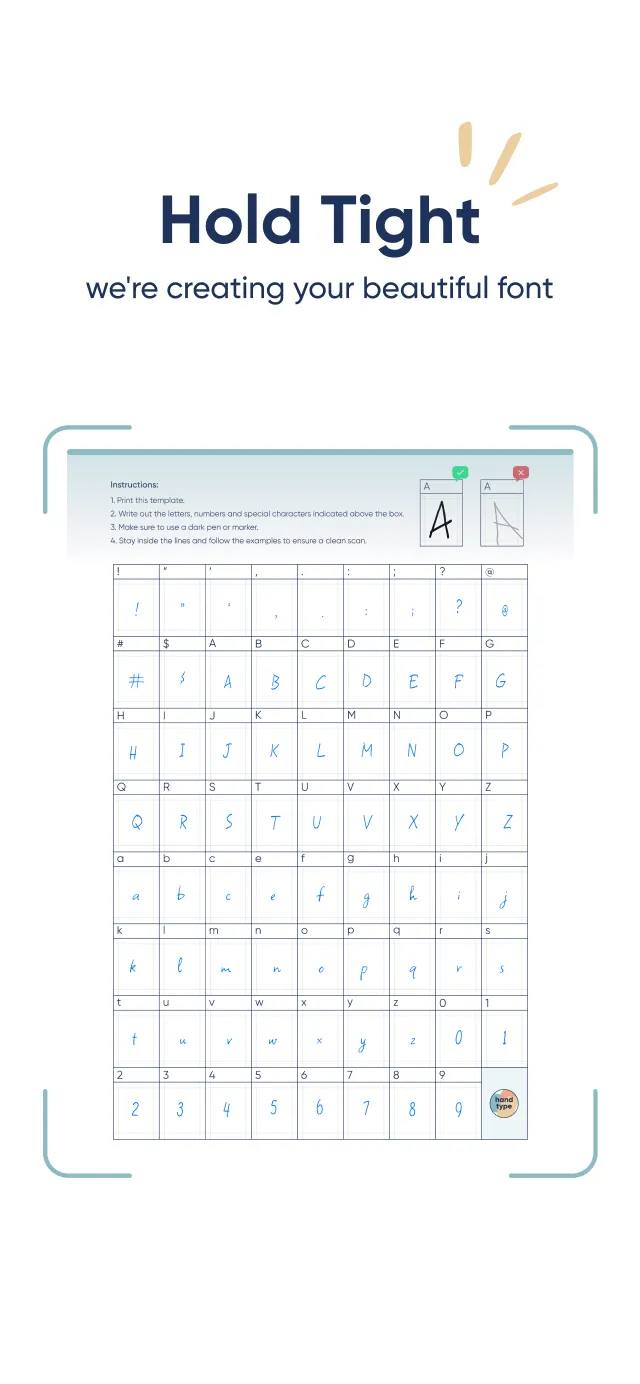
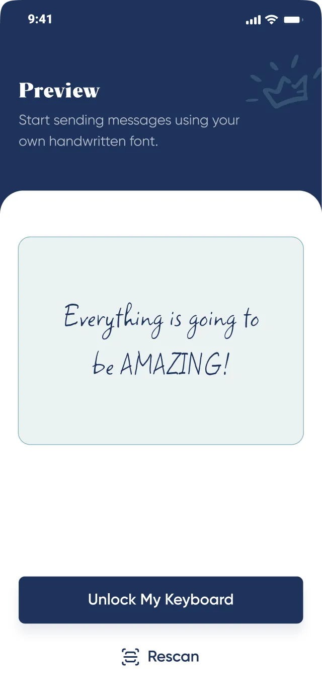
One of the key features of the Handtyped app is its ability to create customized digital fonts based on a user's handwriting, which is achieved through the app's handwriting scanning technology.
-
We incorporated the brand's color palette, as outlined in their guidelines, into the app's design to ensure consistency and enhance the overall user experience.

Structuring user journey through wireframing
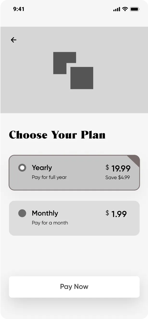
We created high fidelity wireframes to visualize its structure of the app. This enabled us to clearly define the application’s features and functionalities.


Setting the visual tone
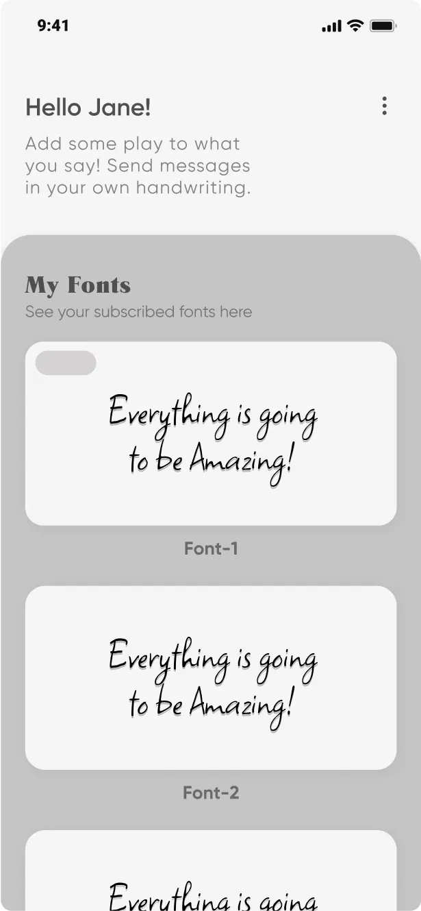
In order to establish the visual direction for the application, we designed several versions of the dashboard and collaboratively worked with the client to select the most fitting option. Throughout the design process,

we maintained open communication with the client and made revisions to our designs based on their feedback and requirements.


Key screens
We effectively addressed the challenges of Handtyped by incorporating the following key screens
-
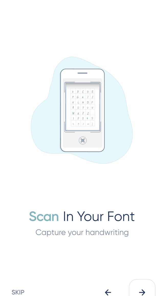
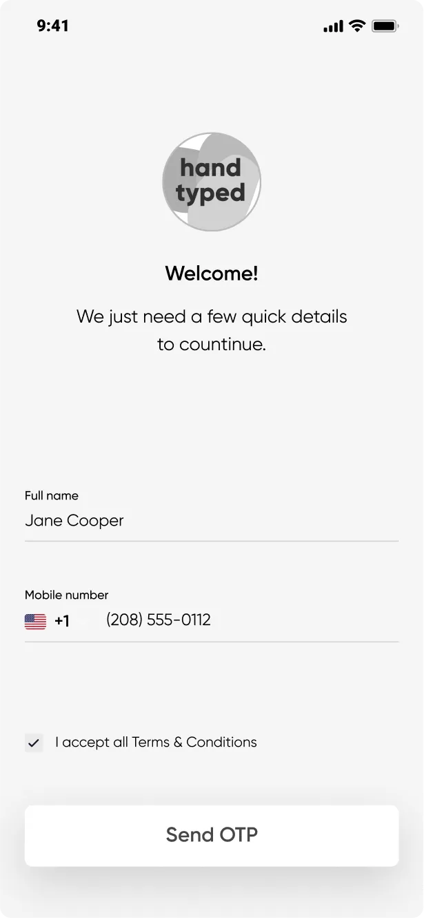
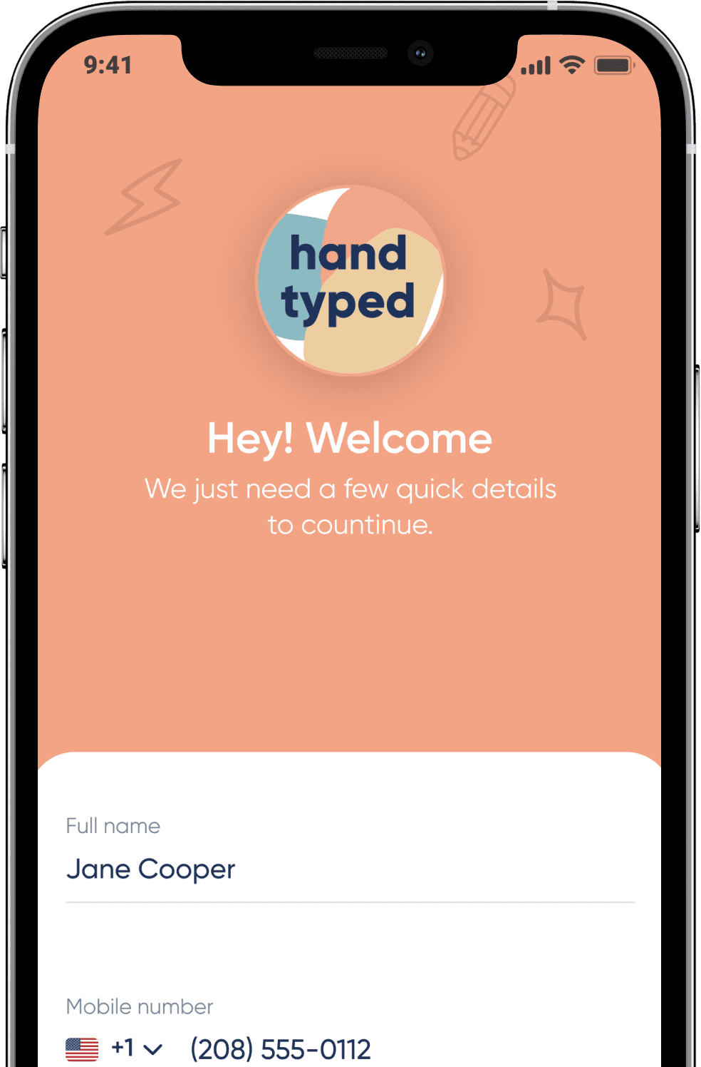
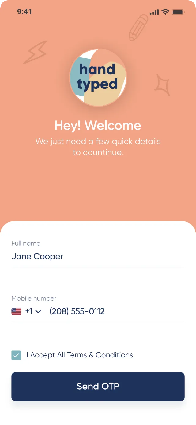
Interactive onboarding
A onboarding which helps users to understand the application’s flow and functionality.
-
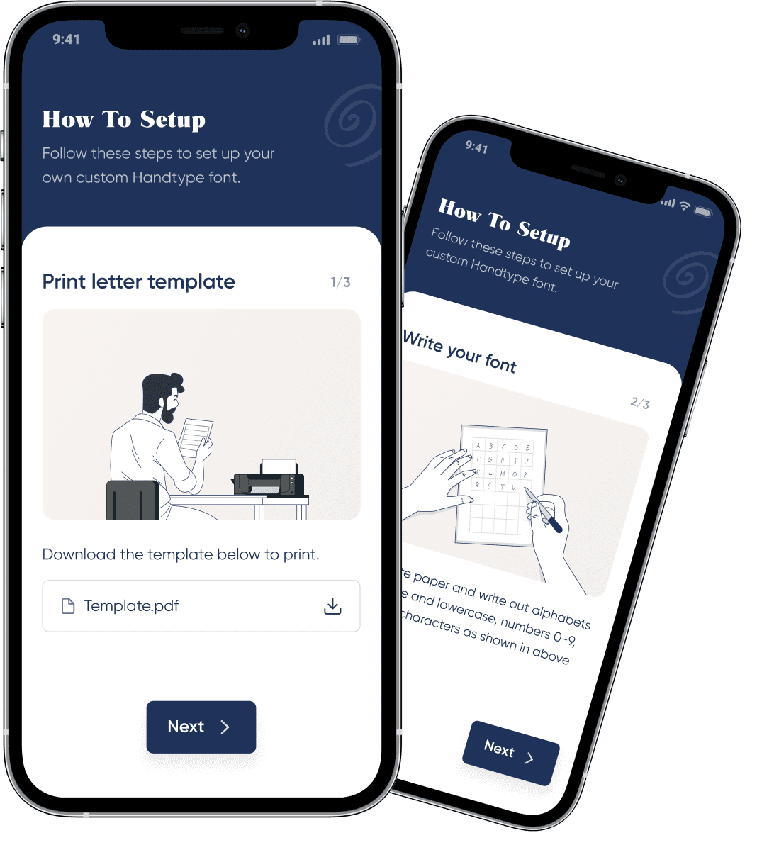
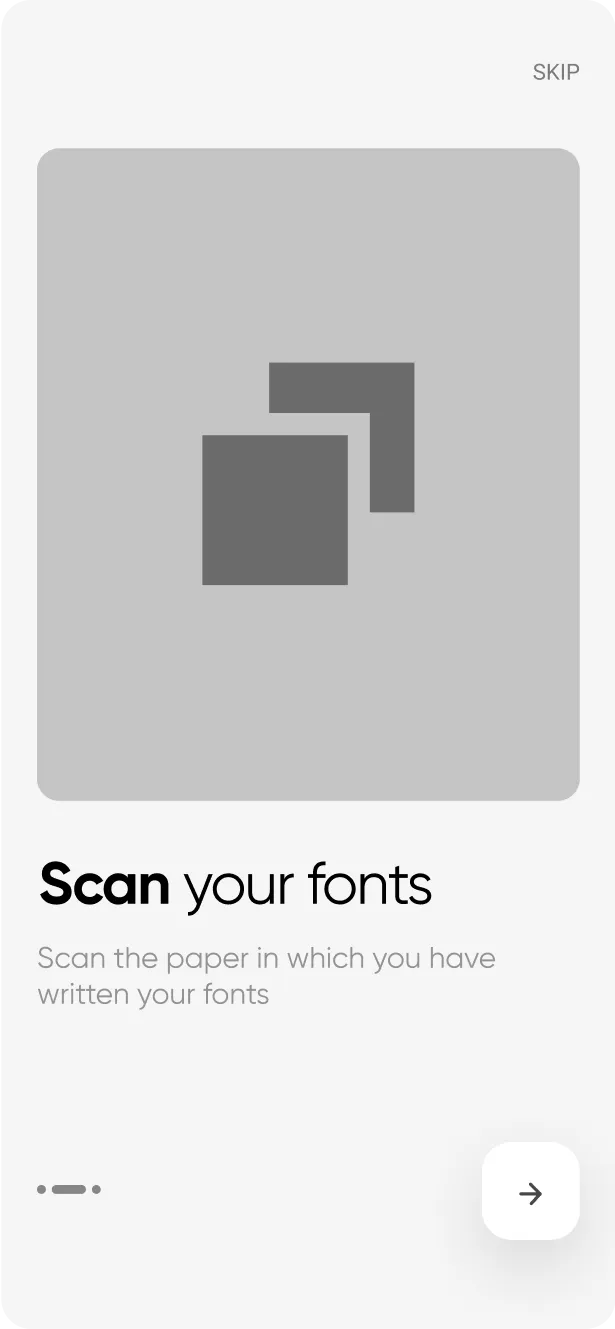
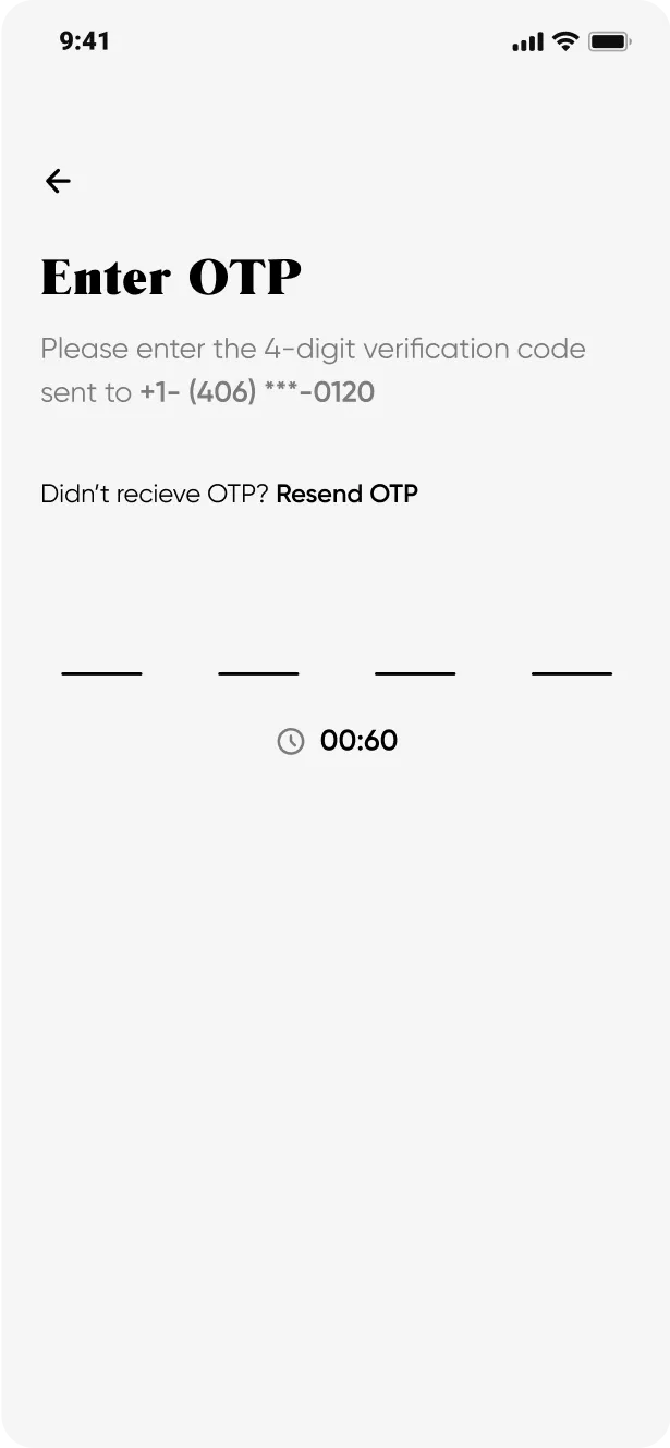
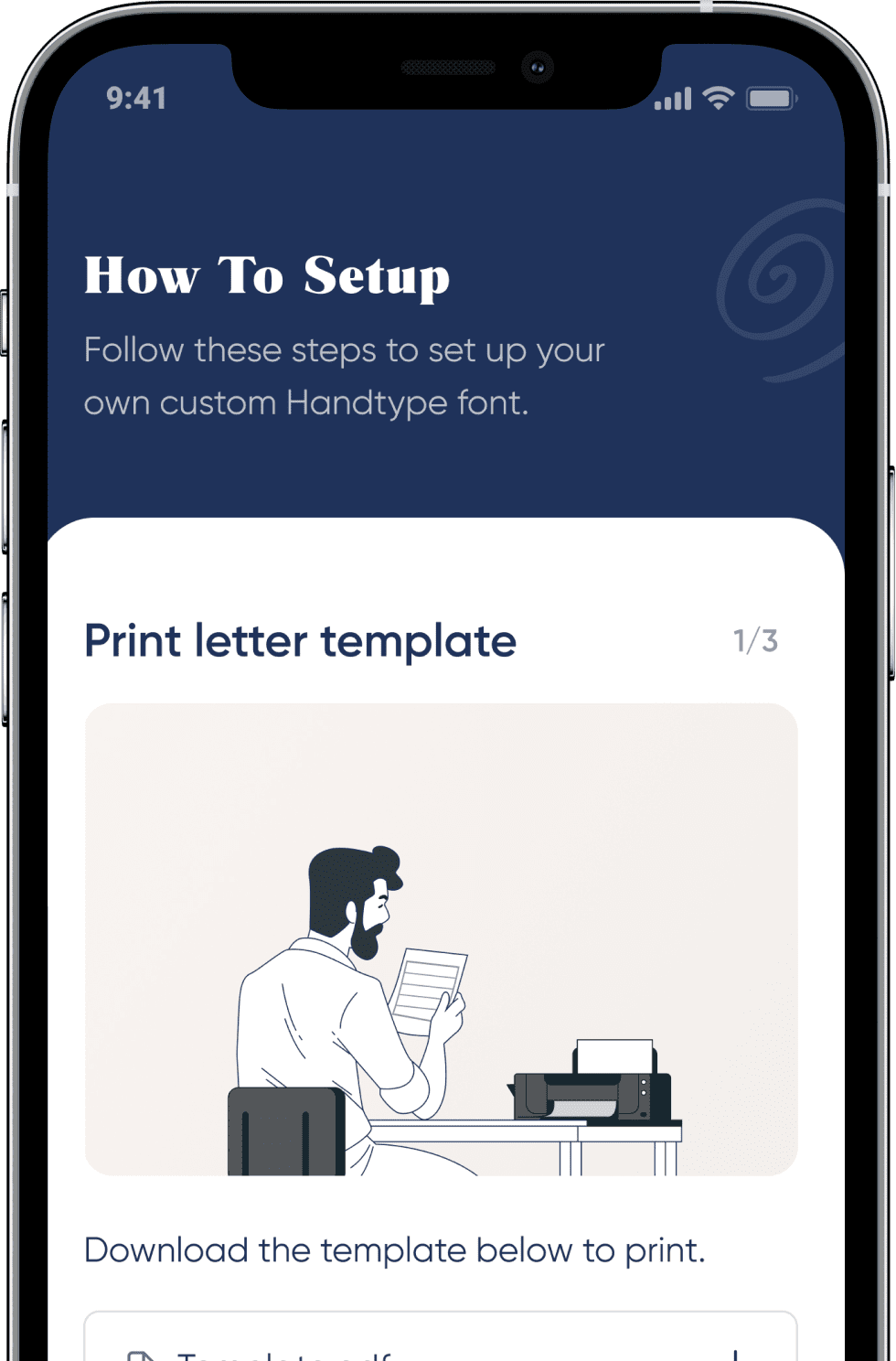
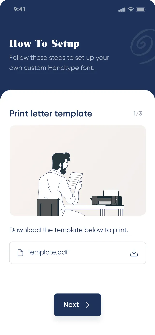
How to setup
There are few screens after the onboarding which guides users how to create their fonts.
-
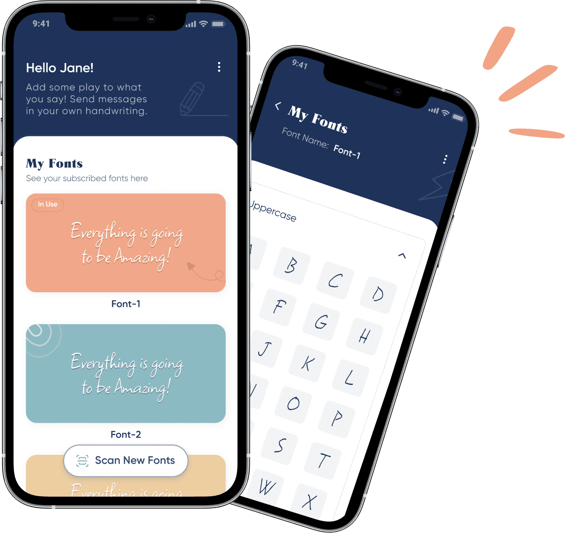
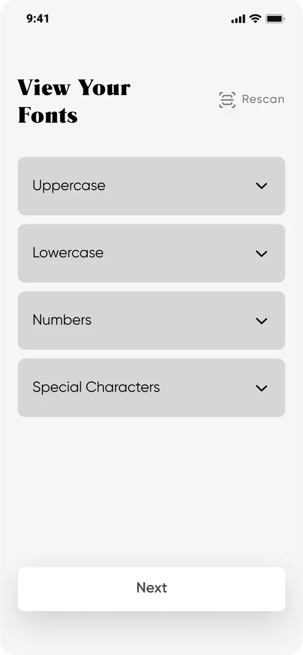
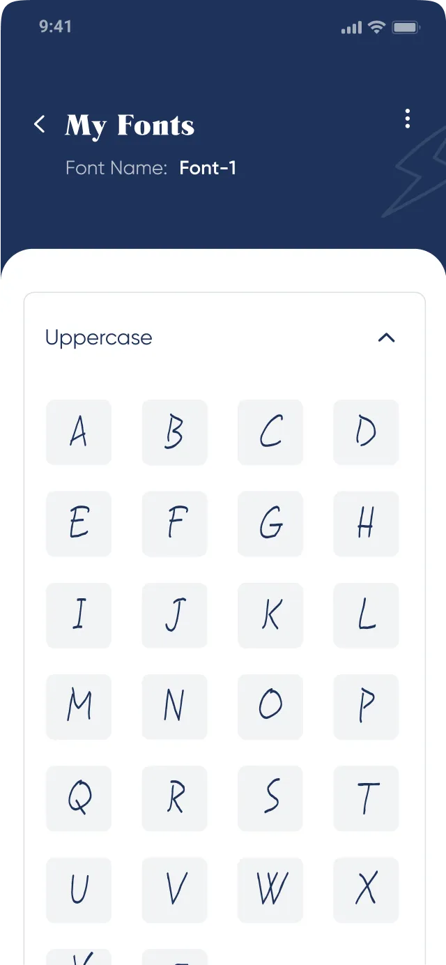
Easy to mange fonts
Fonts can be easily be managed by the application’s dashboard.
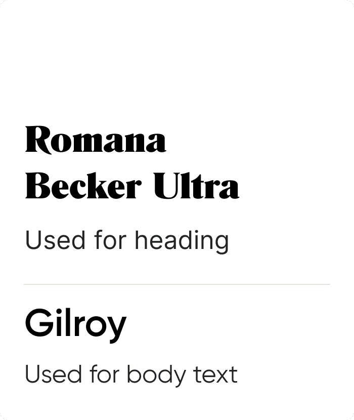
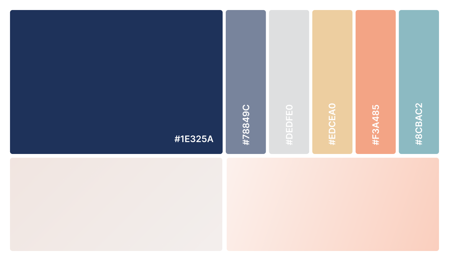
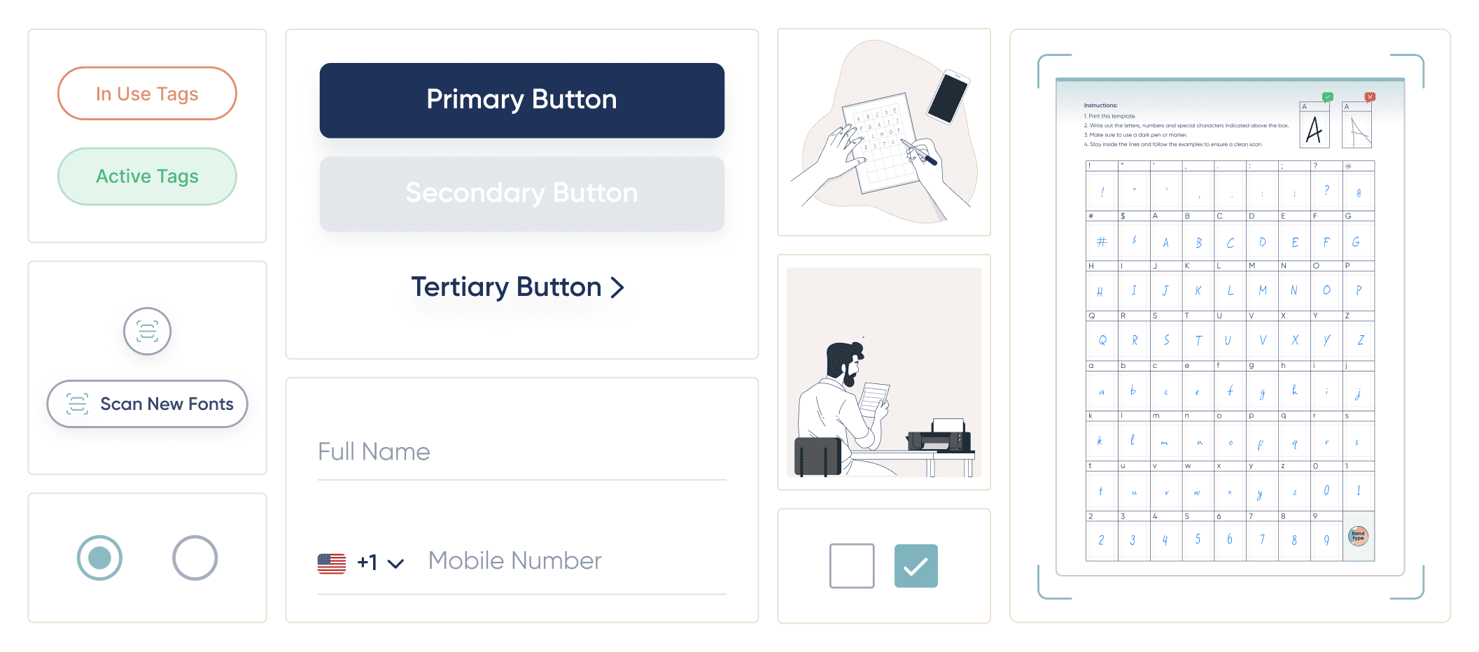
UI kit
In order to establish the visual direction for the application, we designed several versions of the dashboard and collaboratively worked with the client to select the most fitting option. Throughout the design process, we maintained open communication with the client and made revisions to our designs based on their feedback and requirements.
-
Typography

-
Colors

-
Components

What we delivered
After a series of revisions and virtual meetings with the client, we confidently delivered the final designs. The app received an overwhelmingly positive response from users upon launch, resulting in hundreds of downloads across the globe on both the Google Play Store and Apple App Store.
-
125+ hrs
Focused design work
-
15+ hrs
Discovery sessions and feedback meetings
-
40+
Screens designed
Have a healthtech project or idea in mind?
Let’s connect and understand how we can collaborate to take it to the next level!