Minimalism and why less is more in UX design
Dec 30, 2022

You’re likely no stranger to the fact that the age-old notion of minimalism is all the rage in the web and app design world today. You’ve probably heard it being casually thrown around in many design discussions.
Make no mistake, though — minimalism is not just another internet fad that’ll come and go like the wind. It’s not about half-arsing a design to hit the deadline or simplifying things for the sake of slacking off.
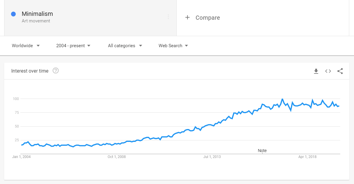
Source: Google Trends
On the contrary, minimal designs are more difficult and time-consuming to realize, given how going minimal compels you to really prioritize what is most essential and trim the fat from your design.
In this article, we’ll explore why it’s gaining popularity again and why less really is more when it comes to user experience design. But first…
What Is Minimalism, Exactly?
“Simple yet elegant” is probably the best, most succinct (or, you could even say, minimalistic) way to describe the idea behind minimalism in design.
The purpose of a minimalist design is to make the content shine — to communicate your offerings concisely and effectively. After all, content is king.
A minimalist design is one that doesn’t beat around the bush and delivers exactly what a user expects, without any fluff. And when practiced effectively, minimalism greatly improves user engagement (sign-ups, social shares, and what have you) and user retention (think Apple users always swearing by Apple products).
In other words, it’s about stripping off all unnecessary elements and keeping it simple, including only the most essential elements that serve a functional purpose besides looking pretty.
Hick’s Law and Its Consequence
Hick’s law is the guiding force behind minimalism. In a nutshell, it states that the more choices you present your users with, the longer it will take them to reach a decision.
Too many choices only lead to more confusion and eventual irritation. Users don’t want to invest their precious mental energy and time interpreting how to use your app or website. They just want to get things done, as elegantly as possible.
Zach Watson, former Director of Content at DePalma Studios, neatly puts it as “Reducing how many functions are offered in each part of a website, app, or platform can optimize your users’ approach to decision making. Fewer stimuli support a faster decision-making process and create a focused, more comfortable user experience. Applied wisely, a minimalistic design practice helps users see the core elements of the interface. The user’s path then becomes intuitive and powerfully purposeful.”
How Minimalism Facilitates a Better UX
If you’ve been following along until now, you can already begin to appreciate the brilliance of minimalism. Now, here are three big reasons why minimalism makes sense in crafting stellar UX:
Nobody Likes Cluttered Design
Clutter is a total buzzkill. Just as nobody likes a cluttered desk or a cluttered mind, not a living soul likes a cluttered site or app design.
Take a look below at the home page of the renowned American department store chain, JCPenney. Look at the baffling clutter. Can you immediately make sense of what to do next? Not likely.

With so many distractions — offers, coupons, buttons, and whatnot — how do you know which content is important and make a quick decision?
And so, it’s crucial to kill the clutter. A clean design draws the user’s attention to the core details and content without causing overwhelm. Beauty indeed lies in simplicity.
Everybody Loves Easy Navigation
Like any typical adult human, you’re in a hurry. You don’t want to waste time navigating your way through an app or website. If, as a user, you’re left wondering “what next?” for too long, you’ll become frustrated. You might even ditch the site or app entirely in search of better alternatives.
With a minimalistic design, you make navigation seamless and intuitive. That is, with little-to-no conscious thought, users will be able to navigate your website or app effortlessly.
You Want to Exude a More Professional Look and Feel
Do you not? Of course, you do! As Leonardo Da Vinci said, “simplicity is the ultimate sophistication”.
It’s a rather bizarre psychological effect, but when you have a high-quality minimalistic design, it ultimately makes your company look bigger. The user gets a feeling that you don’t have the need to prove anything to anyone, that you know what you’re doing.
When you don’t have a lot of unnecessary stuff jamming your website or app, users can see the bigger picture — the benefits (not bloated features) of using your product or doing business with you — which makes your company look more professional.
Technical Benefits of a Minimalistic Design
The best part about a truly minimalistic design is not that it’s more aesthetically pleasing or user-friendly, but rather, it’s more functional. Consider the following four benefits:
Faster Load Speed
A website or app that’s brimming with superficial design elements will load sluggishly. And a slow-loading product is a bad product.
If you talk about websites, in particular, slow loading speed will cause the visitors to become restless and annoyed. They won’t hesitate to simply close the tab and go to a competitor’s website that loads faster. This means higher bounce rates and bad UX.
One of the biggest technical advantages of minimalist design is fast loading speeds as there are very few design elements (such as unnecessary stock images and videos) to load. This makes for pleasant user experience.
Higher Rankings
Speaking of websites, faster load speed due to minimalism also translates to higher rankings on Google. That’s because site speed is a confirmed ranking factor.
Plus, if your website loads in the blink of an eye, bounce rates are sure to go down too. Combine fast loading speed with useful content and elegant design, and you’ve got yourself a website worthy of ranking at the top of search results.
Fewer Server Resources
Less needless elements and content means that your server will never be overloaded, which means optimal performance at all times.
Easier Maintenance
Yet another reason to prefer a minimalistic design is that it demands minimal (pardon the pun) time, effort, and resources for maintenance. The reason being that the development of such a design is streamlined and well-thought-out.
Besides, minimalistic design can almost be considered timeless — there’s almost no need to update the design every other year. New design trends will come and go, but minimalism is here to stay on top.
Final Thoughts
With so many clear benefits of adopting minimalism in product design, it’s easy to see why most modern SaaS startups opt for a minimalistic design over a clunky, feature-bloated one.
What’s your take on this? Let us know in the comments below!
Tags
Chintan Bhatt
Founder and Design Director

