A UX designer’s guide to content strategy
Dec 30, 2022

A UX designer is not a content strategist. A content strategist is not a UX designer. However, without the context of the content, the designs would be less meaningful and most probably will fail to provide solutions to user concerns associated.
Any digital product or service is merely a channel for communicating the content. Designs without the understanding of the content are internally void and showcase the lack of product or service’s value.
You do not visit a website just because it looks attractive; you visit for the content. Content helps design communicate, in a way, it complements the design. Hence, designs without content are a work of fabrication. The need for design across any industry is to solve problems through fundamental ways. Design compositions help the narrative of your content by providing context, intent, and generating trust. In-Short it brings life to your content.
From the UX perspective, content strategy deviates a little from its actual definition. Here, content strategy acts as a catalyst for system design. In a way, it is a process of using data and research evidence to provide the audience with the content they need, in a way they expect at the time they need.
In this guide, we’ll attempt to familiarize all the UXers by exploring the convergence of design and content strategy in UX Design. We’ll go through on how to include a content-first approach to mainstream UX designing techniques leading to the creation of better User Experience.
Now we know that content strategy could impact many aspects of user experience. Content strategy is effective in any initiation that requires content creation, delivery, and planning. The motive for content creation could be anything from marketing, branding and to what we’ve been discussing here- to build a better user experience.
We’ll go through some of the practices which involve the active influence of content in creating a better UX for the audience.
Setting The Content
Firstly, try to identify the user needs as a base to build your content strategy, then convert them to a definable story so that it is translatable to all the team members and stakeholders involved in any meetings.
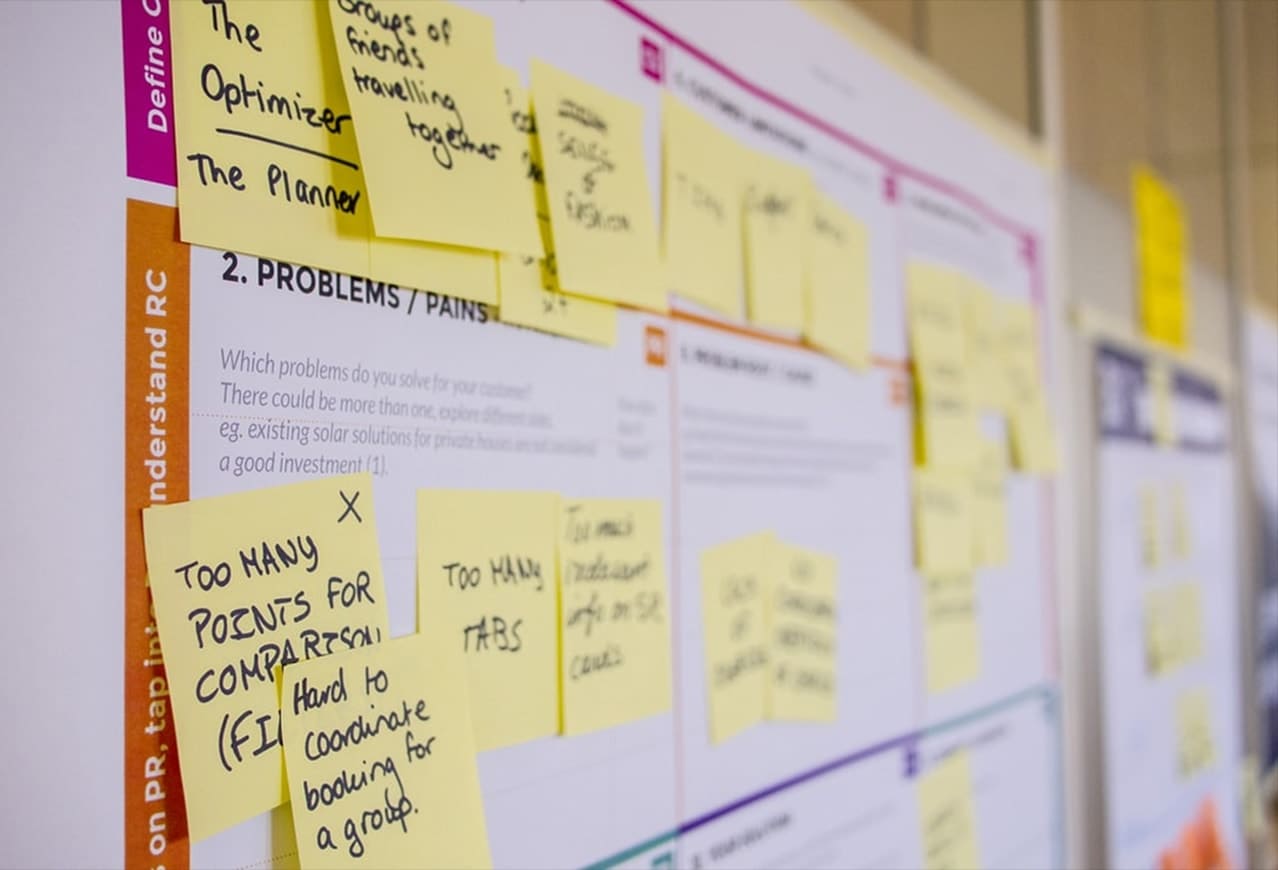
Competitor Analysis
Identify a list of 4-5 competitors and analyze their respective pages. Find what content methods are they using to achieve the result. Maybe, frame predefined questions which can help in such situations.
Questions like:
- What language and labels do they use?
- How specific is their content?
- What content elements do they include? Videos? Audios?
- What content mediums are they using and how?
- What’s the tone of their voice?
- What content do they leave out?
Here’s an example of an educational institute’s admission page
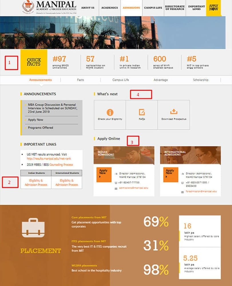
A few competitive UX insights gathered from Manipal University’s home page:
- Manipal has used up some space to cover facts about their institute. It is a small form of branding. Does the client require anything similar?
- They’ve different admission process and eligibility criteria for Indian and International students. Is it the same for the client?
- Manipal has provided the option to apply online, along with that it also includes contact information of respective personnel/committee based on the student’s nationality. Is the client taking an application online? If yes, where does it exists in the current version?
- They’ve added a FAQs sections along with the eligibility check and an option to download the brochure. Is there a need to include FAQs? Does the client have a soft version of their prospectus brochure?
This is just a small example; you could scrutinize competitors page much and juice out further more insights. Also, do not limit to one, do the same process for at least four other competitors.
UX Audit
UX Audit is an audit of one’s own brand or website to compare it with competitors and understand what is lacking or what more can be added in terms of content.
A UX team uses a combination of qualitative and quantitative techniques, skills, and tools to consolidate, study, and investigate user interactions. Through analytical methods, potential issues and triggers get discovered, which later go through usability testing — eventually, recommendations and suggestions based on the findings are made.
Few of the techniques and tools used in UX Audit process
- Heat Map Analysis- It helps auditors to visualize those spaces on the webpages or app screens where users happened to clicked the most or provided some form of input.
- SWOT- It’s a descriptive method that organizations use to identify strengths, weaknesses, opportunities, and threats of the project (design).
- Funnel Analysis- Somewhat extended version of user flows, explained above. The series of the event towards the goal gets analyzed in the process.
- Session Log Reviewing- Session Logs allow company representatives to track user activities through their logged-in sessions on websites or apps.
- Acquisition-Behavior- Conversion Rate- Tracking and analytical tools such as GA, allow the websites and applications to these rates, which provide a lot of insights to the businesses.
- Surveys & Polls- Pretty much self-explanatory, reviews and polls help businesses to collect information in form opinions and answers directly through the consumer.
Here’s a sample of UX Audit done by Iglika, a UX/UI designer for one of her clients, this will help you understand the process from a practical perspective.
This image includes screenshots of the existing web pages. Here, she has marked points on the image and defined what according to the audit is not working for their website and possibly the reason for their high audience bounce rate.

Sample UX Audit- by Iglika of the homepage

Sample UX Audit- by Iglika of the Landing Page
Such an actionable UX/UI audit of their website gave us insights on the pain points that were causing the hindrance to their website’s active user engagement and objectives, which in turn affected Client’s conversion rates and other end goals.
Mapping User Flows
Start mapping user flows concerning the stories developed from defining content in the first step. This activity will reveal the actions and critical interface points that users interact with while they’re on the site/app.
Consider where the user arrives from, which steps they take after visiting, giving you more insight and context into user behavior.
To achieve this, you could use the help of Google Analytics

Screen capture of the user flows feature in Google Analytics. It can be found under the Audience section in the side panel.
Using the User Flow feature under Audience sub-section, you can understand how the visitors are behaving on your site providing you answers to these questions:
- What actions are they performing?
- At point (webpages) are they dropping off?
- How are they navigating around the website?
- What is their pattern of interaction?
- Which are the top landing pages on the current site, and what content do they include?
You could do further analysis by setting up goals in GA for your websites.

The Goal Flow feature lets you know the source point of every interaction that achieved the goal point. You could also use the dropdown to track goals using event and custom variables.
Tracking existing user flow to create mapping structure gives heavy loads of insight to UX designers on how to channel further changes or iterations.
Thought Sketching
These early design activities give insightful details about current user interaction, interface, and content.
The core team works on sketching designs for the platform prioritizing the defined user needs. Later, every person involved is required to ask a question and critique the ideas, to further develop the models and concepts through suggestions.
Concepts are still raw, but even at this stage, they manage to draw significant insights into the content.
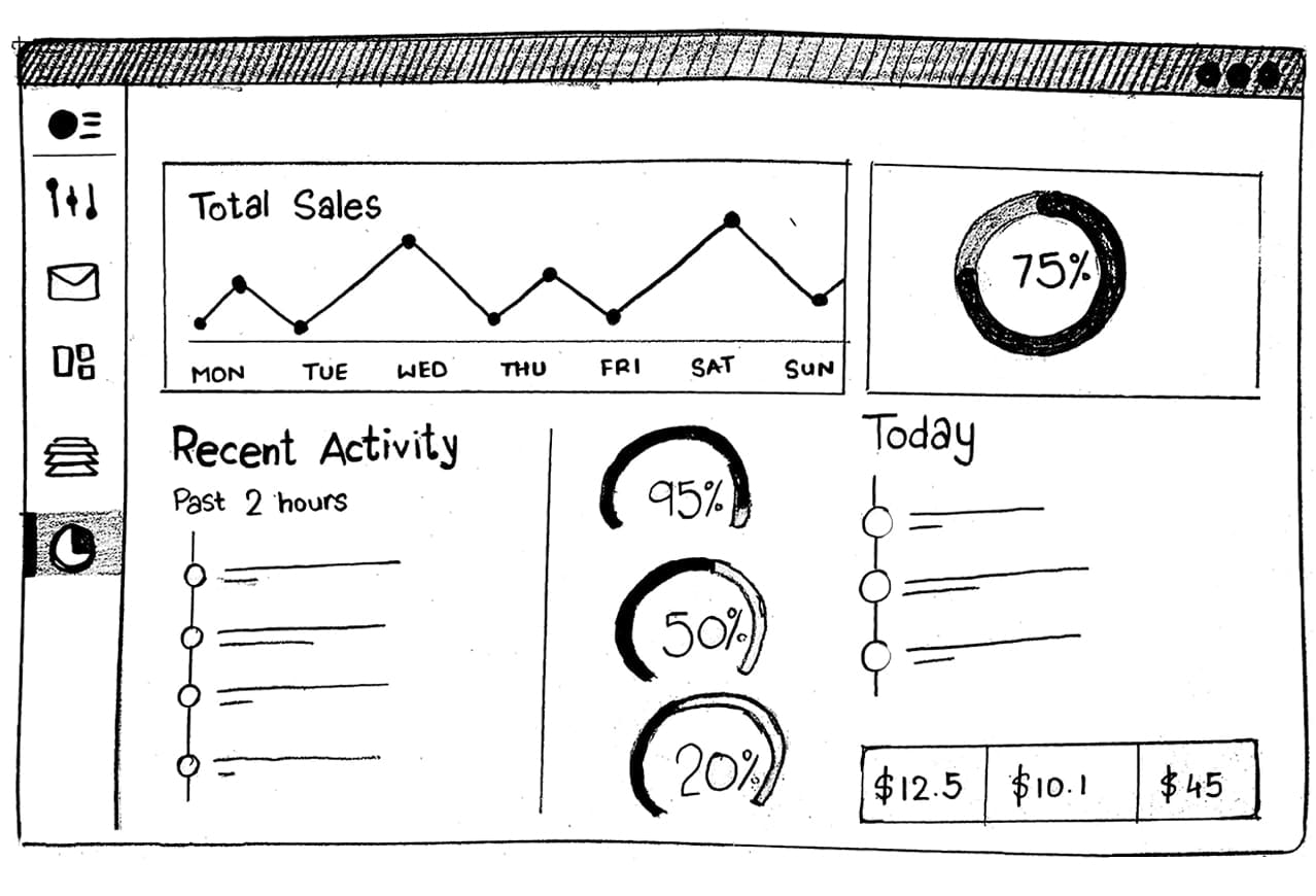
Example: Preliminary sketch design of a dashboard
Typically, these could be framed to question, and answers could lead to improvement:
- Should we include images of the subject? Is there any resistance?
- Should we provide an “As a question” feature for the visitors?
- Is there any dead furniture on the current webpage that could be removed/replaced?
- Should we need more specifications regarding the term International? Maybe define regions?
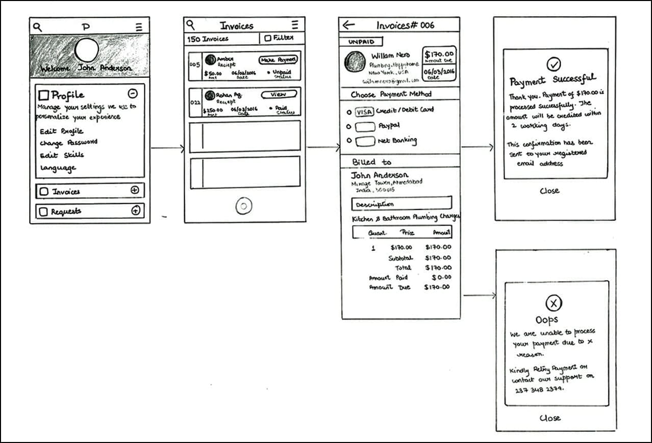
The rough sketch can, for sure, help us define the content elements required to support the identified user needs. Early illustrations will undoubtedly be iterated and redesigned. Before thought sketching, consider reading the common mistakes to avoid while designing a SaaS-based product.
Prototyping and Content Relevancy
Once we have got the initial sketches and content, we can take a step ahead to digitalize the designs and get ready with some necessary user testing.
Moreover, in what manner may you decide to create your prototypes, please do not use “Lorem Ipsum Is Dummy Text.”
Why Not Use Lorem Ipsum?
Cramming Lorem Ipsum into a wireframe is not a great approach. It hardly reveals anything about the relationship between design and content. It is simple; it’s meaningless and has zero context.
Also, no one ever said you require perfect content to define prototypes; having something is better than gibberish. Luckily, there are some ways to put together designs with validatable content:
- Use current content
- Use sample content (unpolished)
- Use random throwaway content, but has context
- Use competitor content
This content won’t be the final content, but it does to some extent reveal valuable insights, like:
- Does this input field for email need a size tweak? Maybe long email ids might get squashed when typed.

The input field is clearly not long enough lengthy emails.
- The label phone number might not be required, and it is overcompensating the design.
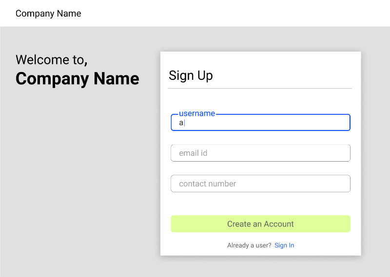
Smart use of micro-interaction and placeholder solves such problems
User Testing and Validation
This is the stage where your semi-developed product undergoes the scrutiny of human usage. It’s time you put your low-key prototype to test and collect some feedback from the users. Assuming that you use proto-content instead of the Lorem Ipsum, hopefully, you’ll be able to receive some intriguing insights.
During the testing phase, pay close heed to how your content is being consumed and try to capture some answers-
- Identify prerequisites missing to perform the next set of actions.
- Look for if the users understand the content or in any means have misinterpreted the information.
- See if any labels or use of language come off as redundant or unclear.
- Note down what the users found useful and what aspects they thought were unnecessary.
During this session, you’ll collect many observations and also get to know different perspectives giving you heavy loads of beautiful insights-
- “I know male and female are genders – I don’t need to be told that.”
- “What’s the point in asking First Name and Last Name separately, you’re technically wasting space.”
Now, you can add these observations to hypothesize the new iterations keeping the usability in the context. Apply them to the existing prototype, and see if it worked and fell into place during re-validation. There’s always the possibility that some iterations don’t work, but that’s fine.
You can continue this process of testing and re-iterate until all the team members, and other stakeholders feel content.
Obviously, you cannot call that the work is complete, problems arise, and new solutions always find their way, but at this point, the team can start building the platform with the respective designs and get ready for the launch/relaunch.
Conclusion
The user experience you created succeeds based on the fact of how well you facilitated the delivery of the content through your design. The importance of content-first thinking in designing has been growing, and the curve is taking its slide into UX Design.
If you’re someone who thinks that either of content strategy or UX design is more important than the other, then for the self-evident reasons you might be on the wrong path. The synergy between the two is much more crucial than the individuality they possess. An effort towards a collaborative goal will yield much better results.
The new perception of UX Design is generalized towards interfaces of websites and mobile apps. However, UX is much broader, but there’s always a user at the end of the tunnel, so, a UX Designer must be aware of how people consume content and what channels they use for it. Including responses and inputs from the users provides insightful details into developing a defined content strategy.
Of course, the above process won’t guarantee the most articulate designs, but merely adding some new techniques and a content strategist’s perspective to your UX design process could make a lot of difference.
UXTeam is known for its UX strategy and helped several startups to build their product from the ground up. If you’re struggling with digital product design or UX/UI design, get in touch with us. UXTeam has been selected among the UI/UX Design Agencies by Designrush.

